Re:cap | Zidi Xia
Problem:
Music creation is always an emotional process. Musicians and songwriters find inspiration in various ways such as keep a journal, leave the house and let the world inspire them… How could design help music lovers to record their to-go idea, and helps them to develop their ideas?
Solution:
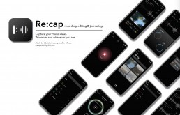
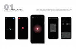
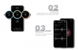
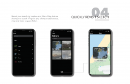
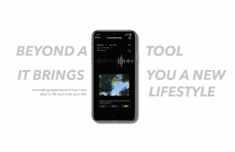
Re:cap is a mobile sketchbook app for musicians, focusing on simple editing and recombination tools to refine your music sketches.
Video Prototype
Reflection
This project is an attempt for me to design an app for musicians and instrument players. From user research to market research, I had been finding core pain points for instrument players who has recording habit, and exploring what music means to them. One of the most valuable aspects of this design project is finding out the unique design opportunity and then accomplish it.
As a flute player, this project also fulfills my own wish. I even hope this app could be developed and to be used in daily life. I enjoyed the design process and hope to keep going to develop my skills in an interdisciplinary field.

Zidi Xia
Hello! I’m Zidi, an interaction designer who loves coding and music. I study interaction design at Emily Carr University of Art and Design, Vancouver, BC. My previous design experience includes UI/UX design, prototyping, digital products for the web and mobile, game design and working with hardware. I also interested in front-end, back-end development. As a designer with a background in music and performance, I have always been passionate about music, technology, and interdisciplinary design.
Contact Me : sharonxzd@gmail.com
sharonxia.com
Us | Katherine Zhang
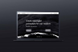
Us is an online service that will allow users to participate in user research and give user feedback in exchange of goods, as well as building an ongoing relationship with brands each participant use frequently.
Problem Space
In a lot of my informal conversations with developers, designers and users, I asked them about the current feedback system for mobil apps. I can’t help but question the current way of giving and receiving feedback for products that have been put out in the world. I found inefficient feedback buttons that left the users hanging when they have encountered a problem, and how it is the only way for the users to get back to product they use. I believe there are needs to be more efficient ways of bridging two groups of people. I was inspired by the idea of bring power back to the users, as a challenge to the current human-centred design method.
Research
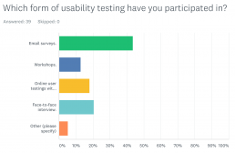
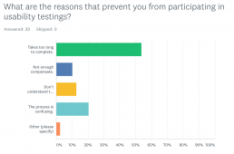
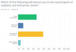
I sent out an online survey to students in Emily Carr University who is in different year and major. I also sent them to facebook to get to know a wider range of participants. Because I did not count their age group, gender, job title or any private information, so the result is very vague.
Understanding the 39 online survey answers in relation with my in-person interview with 3 Emily Carr Students, I got the conclusion of the biggest motivation for people to participate in user research is because they want to improve their own experience of using the product.
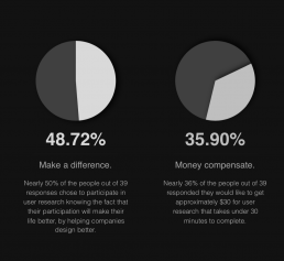
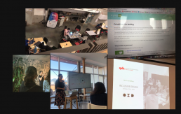
Other than formal interview, I joined workshops and event during the semester to expand my network and research my topic. Those workshops and meetups allows me to connect with people in the industry including designers, business owners and researchers. I am able to chat with them about my project, I gain new perspectives and got to know how the industry is doing user research and what will be valuable for them.
Solution
I spent times to think around the ethical problems in design world, and I want to share my voice by focusing the features of the project closely related to connection building as a new perspective of user testings.
People who are interested in giving feedback to an App will register as participants, they will have different tests recommended to them based on their profiles. When they complete a test they will grant an impact point for that company, they can use these points to exchange products.
If a company want to use my website to gather user feedback, they will first register themselves as Researchers. They will be able to post each testings as a recruiting post with participant requirements and selected incentive method (either privately or on platform). They can also choose to contact participants based on their approval. If they have an ongoing relationship developed with a participant, they can get more direct feedback.
Reflection
This project has been a project for me to grow and explore, finding my true passion and career path as a designer. During my design process, I found interesting perspectives, I want to keep exploring the relationship between users and designer as a future thesis. In the future, I want to explore more design solution around understanding the meaning of user testings and thinking more about design ethic in their design works.

ABOUT KATHERINE ZHANG
An interaction designer graduated from Emily Carr University, dedicated to create visually pleasing designs while focusing on inclusivity, meaningful impact and emotional connections.
Passion lies in creating human and earth centric design solutions for contemporary problems. Always looking for fresh insights while exploring possibilities.
http://www.katherinexz.com
hi.lo | Michelle Chan
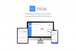
This responsive digital platform aims to integrate family-centered care into diabetes management by demystifying the illness for young patients and empowering them with agency, while encouraging parents to provide the appropriate type of care and support.
Objective
Approach

Values
Redefine “child-friendly” content
Instead of patronizing cartoons and characters, employ accessible and engaging visuals.
Promote engagement in the diabetes community
Forming a community allows child patients to know theyare not alone and parents to share their tips and advices.

Encourage transparency and honesty
In other words, don’t sugar coat things.

Put the child in the middle of their own health journey
Let them be the main participant in their diabetes management.
Encourage caretakers to engage and support
Show them ways they can guide and help their child in an appropriate and non-invasive way.

Provide customizability + tailored content
Every person’s case is unique- narrowing and filtering down the material can reduce confusion and information overload.
Features
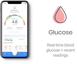
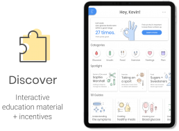
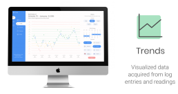
Video Prototype
Reflection
This project was an opportunity for me to explore many elements of designing a product. From participant recruitment and market research to participatory design and creating a platform with 3 responsive device screens, I think I explored quite a number of product design aspects.
The values that I had formulated from this round of research was very crucial to the project. I was excited to see that I was able to lay out the core fundamentals for designing for childhood diabetes management. I think the values really help set the goal for the project.
Michelle Chan
As a process-driven design practitioner and researcher, I am always looking for new ways to research and design to solve real-world problems. My goal is to formulate innovative methods that consider design-thinking and interdisciplinary collaboration. Throughout my career, I hope I can make important changes that will shift the health design culture.
As a student, I strived to explore types of art and design practices. I used each project to learn something new and develop my process of designing. I found passion in elements in interaction design that I loved, such as service design and design research.
IRIS | IGNACIO BARBOZA
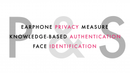
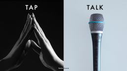
IRIS is an online system that provides a user-friendly, accessible auditory interactive layer for sites of banking institutions. The inclusive system allows for a secure and private experience by incorporating web knowledge authentication, Face and Touch ID. IRIS takes advantage of emergent technologies like voice user interfaces and will ultimately incorporate the latest artificial intelligence software.
IRIS VISION
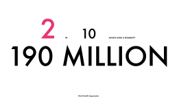
As a child growing up I’ve always questioned how my uncle Marcus perceives the world. He was born with a vision disability in the late fifties in San José, Costa Rica and with limited access to technology, medical, psychological and pedagogical advancements, his life hasn’t been the most lenient. Nonetheless, he’s one of the happiest individuals I’ve ever met.
This is my story of how User Experience Design can raise the technological bar for the promotion of independence and inclusivity for populations living with visual disabilities.
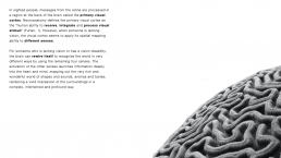
How can design and biology merge to improve the quality of life of its users and enhance human interactions by creating dignified experiences?


IRIS PROCESS
The framework of the IRIS system is constructed upon four main pillars, user experience, accessibility features, employment, and community engagement. Through the applicability of user experience design tools, IRIS reduces the friction between design and disability and incorporates accessible features that are embedded into its operational system.
PRE-STUDY
As part of a pre-study, diverse interviews were done with experts in the field. This phase of the study was done in collaboration with an organization called “Nueva Luz” which is based in San José, Costa Rica.
Additionally as part of the pre-study, and before the user testing was held, several interviews were carried with Cirsa Alvarado, the director of the User Experience Design team at BAC International Bank. Alvarado is responsible for UX strategies in Latin American.
Diverse questions were sent concerning the inclusivity initiatives and programs that the bank runs at a regional level. An analysis of the different digital channels was done and it was concluded that users with vision disabilities don’t have the same access to these platforms as sighted people. A chart was created to understand the different limitations in Digital and Non-Digital services based on the different types of disabilities.
USER DATA ANALYSIS
During the work, an analysis of interviews and user testing was held with users with visual disabilities. The primary objectives were to investigate the contextual auditory information regarding financial transactions, an exploration of the existing digital tools that are currently being used and the possibility of the implementation of voice user interfaces. The findings of the study concluded that multimodal interfaces expedite the process by combining voice, haptics, and quality visuals.
The process of the interviews started with a transcript that served as a starting point for the user data analysis. Later, the most relevant feedback was written down in post-it notes and different thematics were drawn in terms of similarity. The thematics were drawn by chronological order depending on the interviews that were carried.
THEMATICS
It was concluded that the following thematics were predominant in almost all the interviews:
- There is a difference between users with low vision and users who were born blind.
- CVUIs should be able to accommodate in the visual disability spectrum, giving the users complete independence and control over the different functionalities.
- Using CVUIs is not ideal in public spaces.
- Privacy is always a barrier when using online tools.
- Security measures that are currently being implemented are not user friendly or inclusive.
- Some online platforms don’t follow accessibility norms like the “Accessible Rich Internet Applications (ARIA)”
- Some security measures have a time constraint, which in some cases, is not compatible with screen readers.
- Online platforms are usually not user-friendly with screen readers. Users require turning them off, switching their phone settings, etc.
- The visual navigation of newer online platforms is initially hard to learn.
- Users learn to navigate from A-B and B-A.
- A linear navigation method would be the most ideal and inclusive
The goal of this qualitative study was to identify and understand the pain points of users with visual disabilities regarding their administration of personal finances. Moreover, empathize with how they’ve attempted to relieve their struggles with existing tools and gather insights about VUIs and haptics.

CONCEPT
FUNCTIONALITIES
Through the analysis of data, conclusions were made per different concept functionalities. The future iteration of the concept can accommodate different types of visual disabilities, incorporating a multimodal function with a haptic system of voice, vibrations, sounds, and high-quality inclusive visuals.
Since some users indicated that they had low vision, feedback will also be included taking into consideration the use of visual interfaces. IRIS is designed inclusively for users with low vision following the “GOV.UK, Home Office Digital, Data and Technology (DDaT)” guidelines. Originally, the layout of the screens was designed with a high contrast mode, bold and readable text. The system also applies a combination of colors, shapes, and text and follows a linear logical layout. Buttons and notifications are put in context.
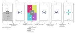
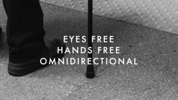
In the case of users with no vision at all, the system runs solely on voice, sounds, and vibrations. The users are provided with an integrated auditory feedback like the sound of a piano key indicating a successful transaction. If a user is stuck or needs to go back in the process the user is instructed to give a verbal command for the system to repeat itself or go back several steps.
CONCEPT STRATEGIES
IRIS is a cloud-based service that allows for the development and design teams to work on it on the fly with bug fixes, updates, and service expansions. The marketing structure of the service is shared with more than one financial institution making a split development cost.
The system is designed to be marketed with a Year One Exclusivity by giving the first banks that acquire the service exclusive pricing. The license of the system is sold as a Monthly Subscription, including service & maintenance costs, making IRIS innovative and inclusive by raising the bar of user experiences in the banking fields.
USER JOURNEY
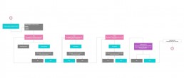
IRIS service is mapped out in a user journey to demonstrate the vision of the project by communicating the possible concept stakeholders, user pains, needs or possible outputs. The user journey also served the purpose of identifying functionality levels, dependent on the level of visual disability. This User Experience tool helped define user flows and the overall information architecture.
FUTURE
The proposed concept would be satisfying to be executed in the future since it would eventually become a very necessary technological solution for populations with visual disabilities, and a design breakthrough that would make me feel personally accomplished.
IRIS will create autonomy, independence, and inclusivity for a population that has been excluded from dignified digital experiences. Having the empathy to understand the struggles that people with disabilities face day-to-day ignited the need to design for those in vulnerable conditions. I felt driven to use my design skills and talent to create a platform that facilitates the banking experience for so many users. IRIS will change and enhance the quality of life with its vision of User Experience Design.

IGNACIO BARBOZA
Ignacio Barboza is a UX / UI designer currently based in San José, Costa Rica. He designs for private and commercial projects within the digital realm and incorporates interdisciplinary practices.
With an educational background in London, England, and Vancouver, Canada, Ignacio designs UX solutions that often improve the quality of life of its users.
Producing empathetic experiences, Ignacio’s work situates in a unique space by having a personal engagement with inclusive design, design for disability and health design. On-brand, deeply rooted in hot Latino flare.
Get Well | Bronwyn Proctor
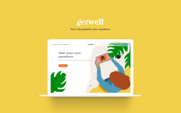
Find a naturopathic doctor, meet with them remotely, and manage your records, completely online.
Scroll and click through the Get Well prototype above.
The Need
More and more people are choosing a more integrative approach to healthcare, and the complementary and alternative medicine market is growing fast. The market size is estimated to be $296.3 billion by 2027, and within that, naturopathy is one of the fastest growing therapies over the past two decades.
Virtual care, also called telehealth, is all the ways doctors interact with their patients remotely. The Canadian healthcare industry is looking at ways to shift towards providing more virtual care options. This focus will help to provide faster access to health care, and meet patient demand specifically for virtual healthcare.
We know the market is growing, more and more people are seeking out naturopathic care, but the discovery and delivery of care is not as accessible or convenient as it could be.
Searching
Finding a naturopathic doctor can be a confusing process and there is no easy way to try out a provider before committing to an expensive initial visit.
Location
Your provider choices are limited by location. If you want to see someone with specific experience, or you live in a remote area, accessing care becomes difficult.
Records
Delivery of documents and records from practitioner to patient are often not digital, or buried in email attachments. Keeping track of your own wellness progress can be overwhelming.
The Solution
Get Well gives patients of naturopathic care everything they need in one place. Find a naturopathic doctor, meet with them, keep all your records organized – all in one place.
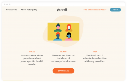
Complete an intake questionnaire and choose from a filtered selection of naturopathic doctors.
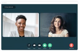
Meet with your naturopathic doctor virtually with video, audio, or text visits.

All your records are organized and safe in your patient portal.
Reflection
As I was wrapping up this project, that I had been exploring for eight months, the world changed in a big way. When I started researching and interviewing people about virtual health in 2019, many people weren’t sure what it was. Some services were beginning to become available for conventional medical services, but there were definitely no options for complementary or alternative healthcare.
Now, with this global health crisis preventing people from accessing their chosen healthcare regularly, many practitioners are looking for new ways to continue to care for their patients.
While this period of time is mostly difficult and overwhelming, I’m excited about the future of health and wellness, and I’m excited to keep working in this field of design.
ABOUT BRONWYN
I believe design is about understanding people and their needs. I’m continually trying to reflect this belief in my work, and keep empathy at the core of my process.

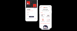
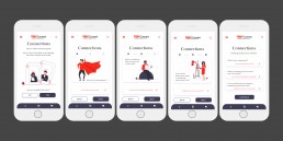
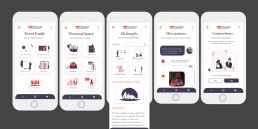
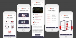
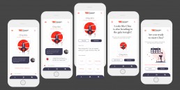
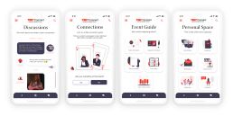
TEDxConnect is a digital platform to help bridge the gap between TEDx attendees, speakers and volunteers. TEDxConnect can be used before, during and after the event through several in-product features within four categories: the event guide pages, connection games, discussion board and reflection pages.
Opportunity Space
Because TEDx is a one day event, it is difficult for organizers, who volunteer for over eight months, to engage with the public throughout the year due to their heavy work load.
- Organizers spend a large amount of time on the day of the event making sure everything is running smoothly.
- Speakers may be too nervous on the day of the event, and might therefore talk to friends and family rather than to connect with the rest of the audience on a personal and more impactful level.
- Attendees may have a lack of confidence to go up to a speaker or organizer in person to network with them.
Due to these unfortunate “day of” circumstances, I realized that TED and TEDx’s values of “sparking conversation, connection and community” (TED) end up unresolved in a larger scale.
Research
The initial research I conducted on TEDxEmilyCarrU explored my findings through surveys, feedback forms and interviews, and how I organized this data using different mapping techniques.
More about my research and process can be found in my medium article here: https://medium.com/@jananiramesh75/tedxconnect-4b71d9319050
Solution
Through year-long research, prototyping and testing, I created a platform where each page is designed with the intent to help the user connect easily to another user, share their ideas, understand everything happening at the event and stay mindful through reflections. Watch the introduction video here:
Reflection
Moving on in this project, I would love to add more interactions within these existing features. Now that I have tackled awkwardness in person, how do I tackles awkwardness online? For example, what if someone doesn’t know how to start a chat conversation? Can I create a randomized way for suggested phrases to introduce yourself or create good opening sentence? I also want to think more about the communal spaces such as the discussions or game board.
Another important part I want to focus on is safety and privacy. Though I have started to work on this a little in the sign up process and messaging pages, I want to think about the specifics of what people can see and what can be done about it. There could be many shady people out there, but perhaps my trust in the TEDx community exceeds what might be reality. I need to give people control of their data and these are the first steps in doing so.
A fun thing I wish I could work on is how you create your own avatar or illustration on the app. You could choose your own background, clothing, body features or more to mimic your lifestyle. This can be a fun way of getting to know others as well.
I’m very happy with how far this project has come along in the past eight months and I hope to see it grow even more!
ABOUT JANANI
An interaction design graduate from Emily Carr University of Art and Design who’s focused on service design, human centered design, user-interface design, graphics and illustration.
Having lived in India, the Netherlands and China over the past 22 years, I take pride in incorporating my cultural background in design practice. With the ability to speak 5 languages, I empathize with those who feel the need to express themselves through thoughtfully designed interactions.
April 14, 2020
Interviewr
Supercharge your hiring process with our interview management application.
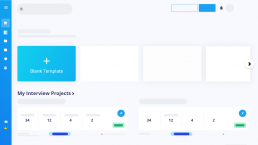
A interview workflow optimized to help you hire great talent
It doesn’t matter if your first time taking on the role of a hiring interviewer. We’re here to guide you into becoming a master interviewer.
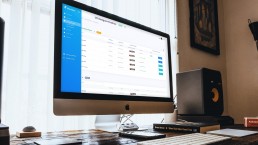
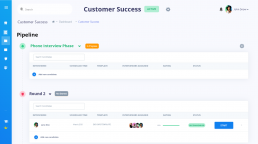
Manage candidates with ease
Get pipeline view, interview templates, automation, candidate recommendations, and more.
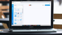
Customize your interview templates
Our template builder is perfect for a variety of different interview use cases. Be it a design portfolio review or a live coding exam, customize your interview experience.
Our Key Features
Building a great team is hard. Using a hiring tool shouldn’t be. Interviewr gives you & your team the power to build & optimize your hiring process, whatever the size.
Team Collaboration
Recruiting is a team sport. Get your entire team involved early and make collaborative hiring decisions in real-time.
Modular-Based Templates
Our modular based template builder provides flexibility towards your interview needs.
Candidate Management
Get a bird’s eye view of your candidate pipeline with our visual drag & drop interface.
Candidate Grading
Set compentancy metrics to grade your candidates. Select from a range of quantitative and qualitative compentancies.
Is this a real thing?
Yes! We expect to launch our beta in December 2021.
About the designer
Philip Cheung is a recent graduate from Emily Carr University. He has worked as a designer for a variety of companies including WIC Marketing and nSite BMS. Philip is involved in the startup community via Vancouver Startup Week, where he volunteers as a graphic designer. Some of his notable skills include UI/UX, project management, and brand strategy.
Niche Travel | Mike Liu
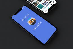
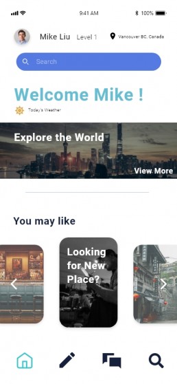
“Niche Travel” An Information exchange based travel app that focus on traveller community
Project Description
This project, with the aim of better serving people’s travel plans and leading a good and unique way of traveling mode, a specific travel app called Niche Travel is conceived and designed to meet the demand for the new trend of travel style.
Apart from the basic functionality of traditional travel apps, Niche Travel is hoped to provide more functions and serve as a personal tour guide that helps people to plan their own travel routes. Moreover, it is also a great platform that organizes the traveling community for people shares the common travel preference with their friends and strangers.
Key Features
Community
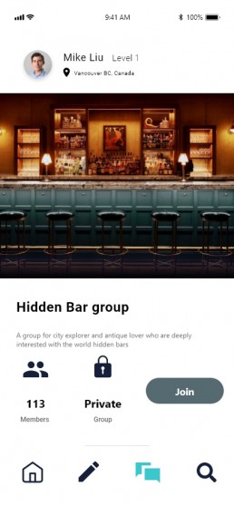
Niche Travel provide a platform for sharing the travel message of the same interest, and also provides a chance for a complete community to make common travel plans or easily share them in a group chat.
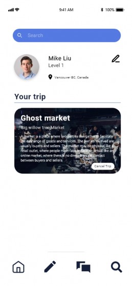
Information Exchange
Niche travel encourage users to provide and exchange
information with each other on the platform. All the information can goes into user’s private customized trip.
Interactive Prototype
About Mike Liu
Mike Liu (Liu Ming Heng) is an interaction design graduate from Emily Carr University of Art and Design who focuses on UI/UX, and graphic design in Vancouver, BC. Originating from Shanghai, China. My goal is to collaborate with both modern innovation and the traditional cultural elements in my design work. I hope to further develop the potential with digital interaction’s direct impact on people‘s daily life.
Co-Creating Alternative Approaches to Women’s Safety
Problem Space:
Women’s safety is an issue around the world, but there seems to be a design blind spot in considering women’s specific safety needs. How can we better design solutions that help female-identifying users feel and be safer when walking in their city?
Solution:
Co-Creating Alternative Approaches to Women’s Safety aims to explore how user research and participatory design can offer us multiple solutions to the same problem, in this case, women’s safety while commuting or walking at night. Complex societal issues such as this cannot be solved with one application or tool, but exploration and conversations about the issue leads us to a deeper understanding informed by and made with the people this issue affects daily. The final product is three different tools, made by three different groups of women, each with a different focus and use related to safety in the public space.
Prototype 1: Google Maps Safety Feature
Prototype 2: Urban Planning App
Prototype 3: Emily Carr University Website Safety Page
If any of the prototypes aren’t loading properly, feel free to access them through these links:
Approach:
As project facilitator, I worked with three different groups of women, who collaborated with me during co-creation sessions, probes and interviews to uncover opportunities for new solutions for women’s safety and to start building and designing the features and purposes behind these solutions.
Through three co-creation sessions, we made three different prototypes for possible solutions:
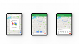
- A Google Maps feature called MoveSafe, that allows users to turn on safe mode that recommends routes with more lights and foot-traffic, as well as an SOS feature and sharing mode where the user can actively share location with their friends.
- A city planning app, which allows users to report safety issues in their community, ranging from a side street that needs lighting to a need for a bus stop somewhere more convenient for solo walkers.
- An institutional solution specific to Emily Carr University, which added a page on the ECUAD website where users could sign up for self defense classes, organize group hikes, and find walking partners for commutes home.
All of these features were discussed and produced collaboratively, and the features within them are informed from insights gained during probe responses, interviews, co-design, and round table conversations. Although I did not plan to have the solutions span from institutional, to local, and global I believe it shows a successful depth of research and communicates the goal of this project to show how important participatory design and research is when addressing complex issues.
Reflection:
I really enjoyed this project, and feel I have accomplished what I wanted to do in terms of co-design and exploration surrounding women’s safety. Over the course of this project I received a lot of positive feedback from the co-designers of co-creations and interviews, as they enjoyed being part of a community of women who were sharing their stories, tools, and techniques they use to feel safe, which is also something I thoroughly enjoyed. One thing I would like to do in future iterations of this project is to expand the co-creation to not just involve women, but other groups that regularly feel unsafe or are often left out of design considerations. Lastly, I would like to work with larger groups of people, which was planned for the project but was cancelled due to the ongoing effects of COVID-19. I am extremely grateful to my co-designer, professors, and peers who gave so much feedback and helped over the course of this project.
About Ginnie
With a passion for user centered research and design, I like to work with methods such as interviews, usability testing, participatory design and surveys, to rapidly prototype and inform product decisions, as well as spur critical thinking about the systems we subscribe to and how they can be re-informed to work better for everyone. I strive to make products and services that are useful, inclusive and accessible to all people.
I recently completed my bachelor’s degree in Interaction Design from Emily Carr University of Art and Design in Vancouver, British Columbia, and I am currently seeking opportunities in qualitative user research, product design, and content strategy or service design.
http://www.ginniemorse.com
Problem Space:
With topics of social justice issues becoming more of a part in our daily conversations, it’s easy to passively support by sharing news on our phones and complain about all that is wrong in the world, but there must be a way we can use digital platforms to bring people to be active supporters.
How can we get people to be more involved with social justice issues?
Interactive Prototype:
Approach:
As the sole designer for this project I was responsible for all steps of the design process from problem discovery to user experience and UI design.
People feel making a change at a global scale may seem like an impossible task. But when they focus on this idea at a local scale the task becomes more achievable. We don’t need big solutions but an accumulation of small changes that will make a big impact.
If I’m going make a digital platform to get people engaged with the local events within their area, it makes sense to design my screens with people in my community. Social justice is achieved best when people come together to support a cause they believe in and actively stay involved in a cause and bringing in elements of that into my design process was crucial. With that in mind, this was a perfect opportunity for co-creation workshops.
1st Co-creation Session:
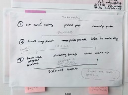
All students at Emily Carr University were sent an email about the co-creation session and the first 10 students that confirmed the RSVP were chosen as the participants. The planned co-creation activities were: Brainstorming though mind-mapping and sketching on the different ways people can get involved in social justice issues. Discussing and talk about what are some barriers people face from getting involved in social justice issues. Narrowing the ideas down from the previous activities and think about how people could get involved in social justice issues for the first time.
Though these activities, I hoped to get insights from the following questions:
1. What are different ways you can get involved?
2. What are some psychological barriers or other barriers preventing people from being active supporters?
3. What are some way people can get involved in social justice events for the first time?
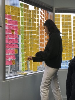
I was left wondering what happened? Did I not set this up right? How is it possible that we took up 1 1/2 hours and only got through the first activity?
After I replayed the co-creation session in my head, I realized how I’m going to approach the session differently in the second round. One of the most important things I learned was that I needed to get a different demographic of people for the next co-creation session. All 10 participants were designers from different fields. During the session I noticed there were lots of suggestions on how I could approach my problem, which was helpful, but each of them had strong opinions and their ideas were clashing.
2nd Co-creation Session:
The participants for the second co-creation workshop were chosen to ensure that I got a broader range of people. The planned co-creation activity was to have participants reflect on a take home question, bring their answers to the session and start co-creating the screens together.
I had asked the participants to answer a question: When you go through the prototype do you experience any of these feelings?
-
- Comfort
- Motivated
- Safe
- Prepared
- Inspired
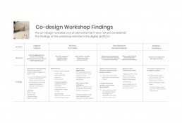
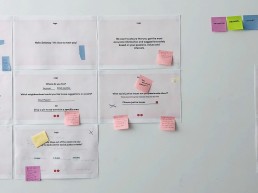
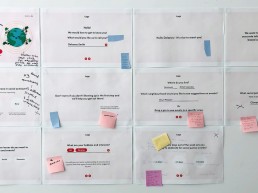
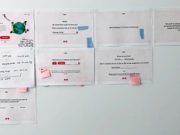
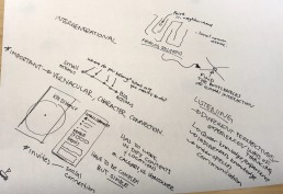
The images above represent the most important aspects of this successful co-creation session. After the initial analysis, I asked the participants to look over the screens, take out screens or add elements that didn’t convey those 5 feelings from the options I gave them in the question. You can see that screens were rearranged, some screens were taken out and new screens were created.
The co-creation workshops heavily determined the final prototype of my design and helped me refine the final project iterations. Since the goal of the project is to try and shift passive allies into active allies, I needed to make sure they didn’t lose interest in the on-boarding process. So knowing how the participants in my co-creation session interacted with the screens I provided, plays a huge factor in the success of my final outcome.
Reflection
The final outcome of my project heavily depended on the collaborative nature of the co-creation workshops. It was crucial to bring in people to get their perspectives on how they would take their first step into being an active supporter to make this project flourish.
The next steps is to run more co-creation workshops and to keep on iterating. There are no such things as finished designs and there’s always room for improvement!
About Jiyun Park
Recent graduate of the Interaction Design Program at Emily Carr University of Art & Design in Vancouver, British Columbia.
With a dual-focused practice that utilizes my expertise in both illustration and interaction I am able to incorporate both into my design work. I am well versed in all phases of product creation, from user research and profiling, to wire framing, prototyping, testing, and delivery.
I believe great designers desire to draw upon opportunities and strive to improve on design standards. Desire drives action.
I’m currently looking for opportunities in product design and UX design in the gaming industry or service design.
https://jiyunpark.com/
April 13, 2020
