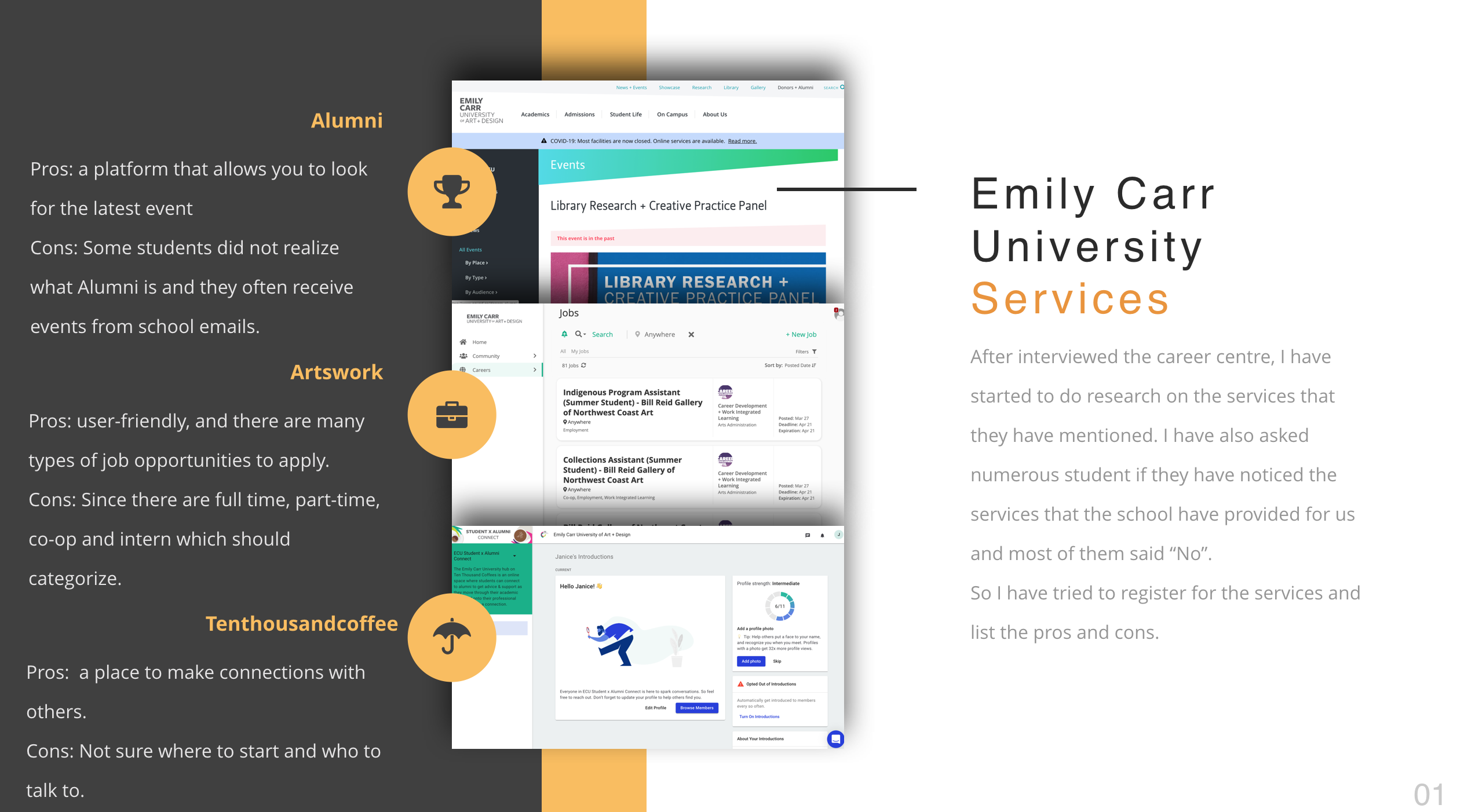
Mobilicity
A Smarter City Challenging Project
by Roan(Lemon) Reimer & Brittany Williams
https://vimeo.com/265050998
"How might we make transit the best option for local transportation?"
Design Context
There are many aspects of the local transit system which work well because they are designed well. Quite a few other aspects only work well due to users familiarity and within that only work for a specific band of users. Feedback to users is an incredibly important principle to place at the forefront of much of our work. To make transit the best option for local transport we must have it work better for more people, especially new and hesitant users we are onboarding.
Design Artefacts
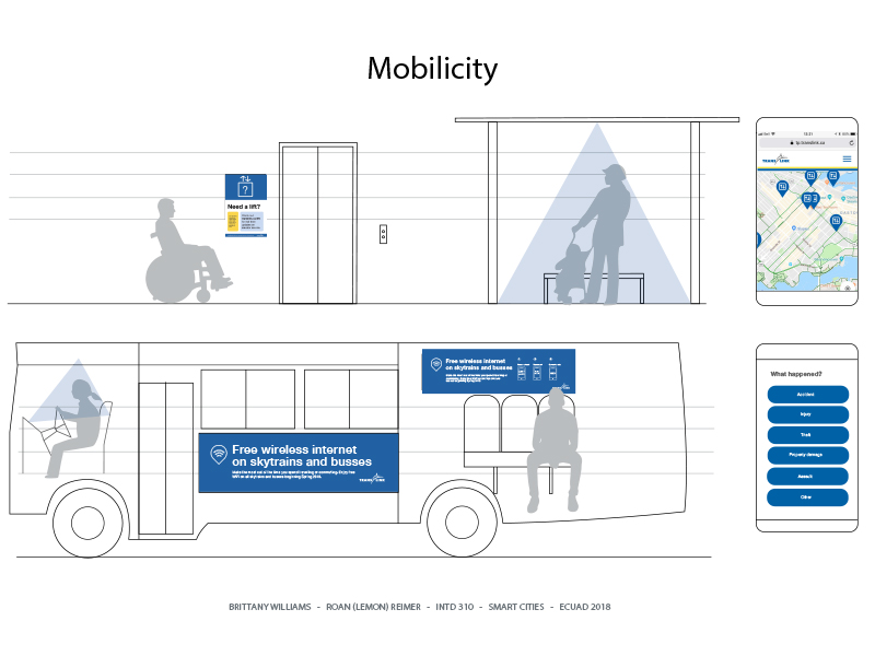
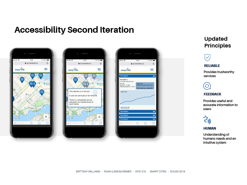
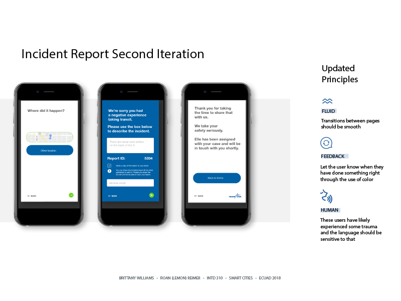 Accessibility and Incident report app-- We started by examining and improve existing safety and accessibility features which contribute to the overall experience of transitters.
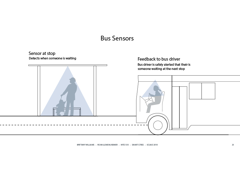 Sensors-- The sensors at stops can detect when someone is waiting and then the bus driver is safely alerted that there is someone waiting at the next stop.
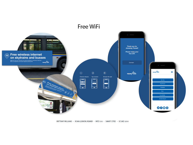 Wifi-- In order to make Wifi more accessible to the public, we provided wifi service on the buses.
Nourishment: Sourdough Making
Nourishment Project
by Brittany Williams

"How can I make the process of making sourdough bread easier and more accessible for the beginner bread baker? "
Design Context
Naturally Fermented Sourdough made by the fermentation of dough using naturally occurring lactobacilli and yeast. Sourdough bread has a mildly sour taste not present in most bread made with baker's yeast and better inherent keeping qualities than other bread, due to the lactic acid produced by the lactobacilli. However, I identified some challengings of Making Naturally Fermented Sourdough and then provided service artifacts to relieves these challengings.
Design Artefacts
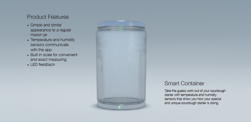
Smart Container--Take the guesswork out of your sourdough starter with temperature and humidity sensors that show you how your special and unique sourdough starter is doing.
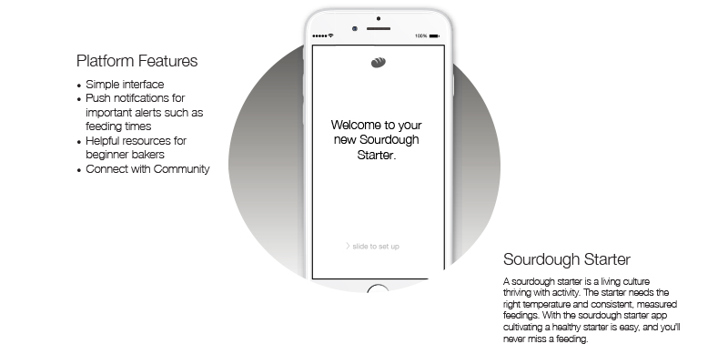
Sourdough Starter App--A sourdough starter is a living culture thriving with activity. The starter needs the right temperature and consistent, measured feedings. With the sourdough starter app cultivating a healthy starter is easy, and you’ll never miss a feeding.

Sourdough Campaign--Sourdoh Campaign encourages bakers of all levels to post their sourdough failures, to remind the community that mistakes are perfectly normal and part of the process of learning how to make bread.
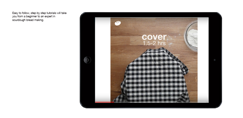
Video Resources--Easy to follow, step by step tutorials will take you from a beginner to an expert in sourdough bread making.
Kombucha
Nourishment Project
by Xinmiao Zhang
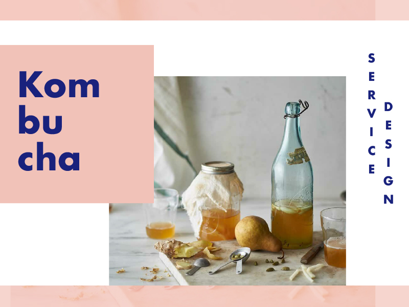
"How can I redesign both the DIY and store buying experience for kombucha lovers?"
Design context
I accidentally bought Kombucha once in the grocery store and the smell and flavor were completely new and kind of shuck to me. After researching it, I discovered that Kombucha is a kind of superfood and there is a group of people who love drinking Kombucha and DIY kombucha because of the healthy factors and the flavors. However, the means and ingredients to handmake Kombucha are hard to get. Therefore, I thought it will be interesting to do a project on it and let more people know more about Kombucha and easy to make by themselves.
Design Artifacts
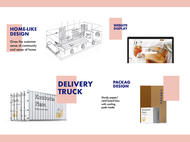
DIY Space--the use of warm colour and soft materials is ideal for my store. There should be a fireplace or television, windows for sunlight to shine through, shades, the big wooden table in the middle, soft sittings, and air conditioning for a comfortable environment.
Service Website-- By creating an account, the customer can manage, track, order, get in touch with us.
Delivery Truck--We transport locally and the truck will act as an advertisement while shipping kombucha to customers.
Packaging-- My concept for packaging is clean simple and heartwarming design. Sturdy cardboard box designed for different packaging of the drink: Glass bottles, paper box, dispenser, etc. The boxes need to have cooling pads inside to ensure the freshness of the tea.
To You
A Smarter City Challenging Project
by Claudia Hopkins & Sandra Han
"What smart initiatives could be developed to encourage meaningful interactions between community members to reduce social isolation?"
Design context
People use social media to learn about others and don’t rely on face to face connections. According to digital inclusion and online centres are social strategies in the UK to enable equitable access to technology and help people feel less socially isolated. In Vancouver, VPL Central is the only branch offering the high demand digital literacy classes. Through this project, we want to explore the opportunity about how VPL classes can come to communities to increase accessibility and then whether digital inclusion fosters a sense of belonging.
Multi-sensory experiences lead to more verbal, communicative interactions with others. Hence, we believe that connections can lead to investments in the city and the community. In order to create the sense of belonging, we created a space to help others get to know each other through experiences as a means to get to know one another and how connections lead to investments in the city and community.
Design Artefacts
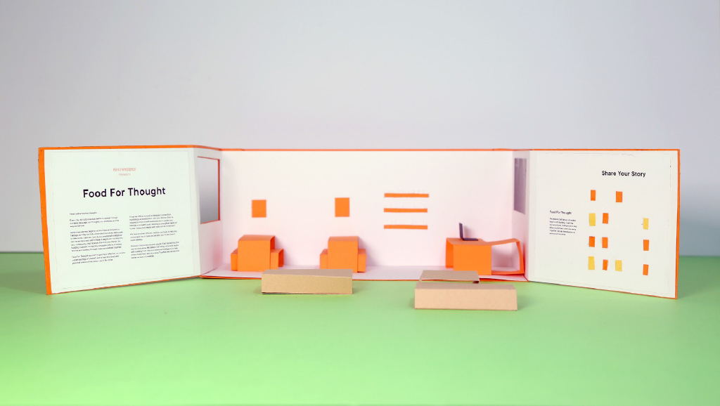
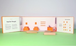
Pop Up Vancouver
These non-profit pop up shops are designed for everyone and anyone open to interacting with the artifacts.
Space--Themes change every season to create new engaging content and relationship with artists and designers are maintained.
Menu--Food was integrated into this service as food enables people to connect more based on culture, and a multi-sensory experience.
Interactive Board--This is an anonymous experience to enable storytelling and find commonality through others’ experiences.
Artifacts and Food-- The artifacts and food allow for the Vancouver Pop Up to be maintained. They also enable a contemplative experience.
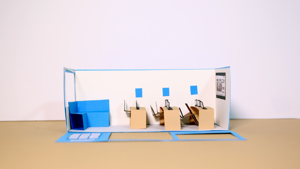
VPL Digital Centres
The underserved or marginalized population that may have low mobility or access to technology based on class.
Needs Assessment-- Curate class offerings for a community, by first accessing needs, then confirming enrolment, and then sending out a final schedule.
Bus Stop Map & Webpage-- A bus stop ad with a map to the online centre is a nudge for people to attend. There is also a link on the bus stop advertisement that goes to the VPL website if the person has a smartphone.
Centre, Classes & Resources -- Offer classes, resources and use of desktop computers. Provide ways of giving feedback through an evaluations form after the course, and have a suggestion box available to empower communities to make the change.
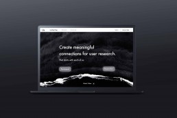
Us | Katherine Zhang
Us is an online service that will allow users to participate in user research and give user feedback in exchange of goods, as well as building an ongoing relationship with brands each participant use frequently.

Problem Space
In a lot of my informal conversations with developers, designers and users, I asked them about the current feedback system for mobil apps. I can’t help but question the current way of giving and receiving feedback for products that have been put out in the world. I found inefficient feedback buttons that left the users hanging when they have encountered a problem, and how it is the only way for the users to get back to product they use. I believe there are needs to be more efficient ways of bridging two groups of people. I was inspired by the idea of bring power back to the users, as a challenge to the current human-centred design method.
Research
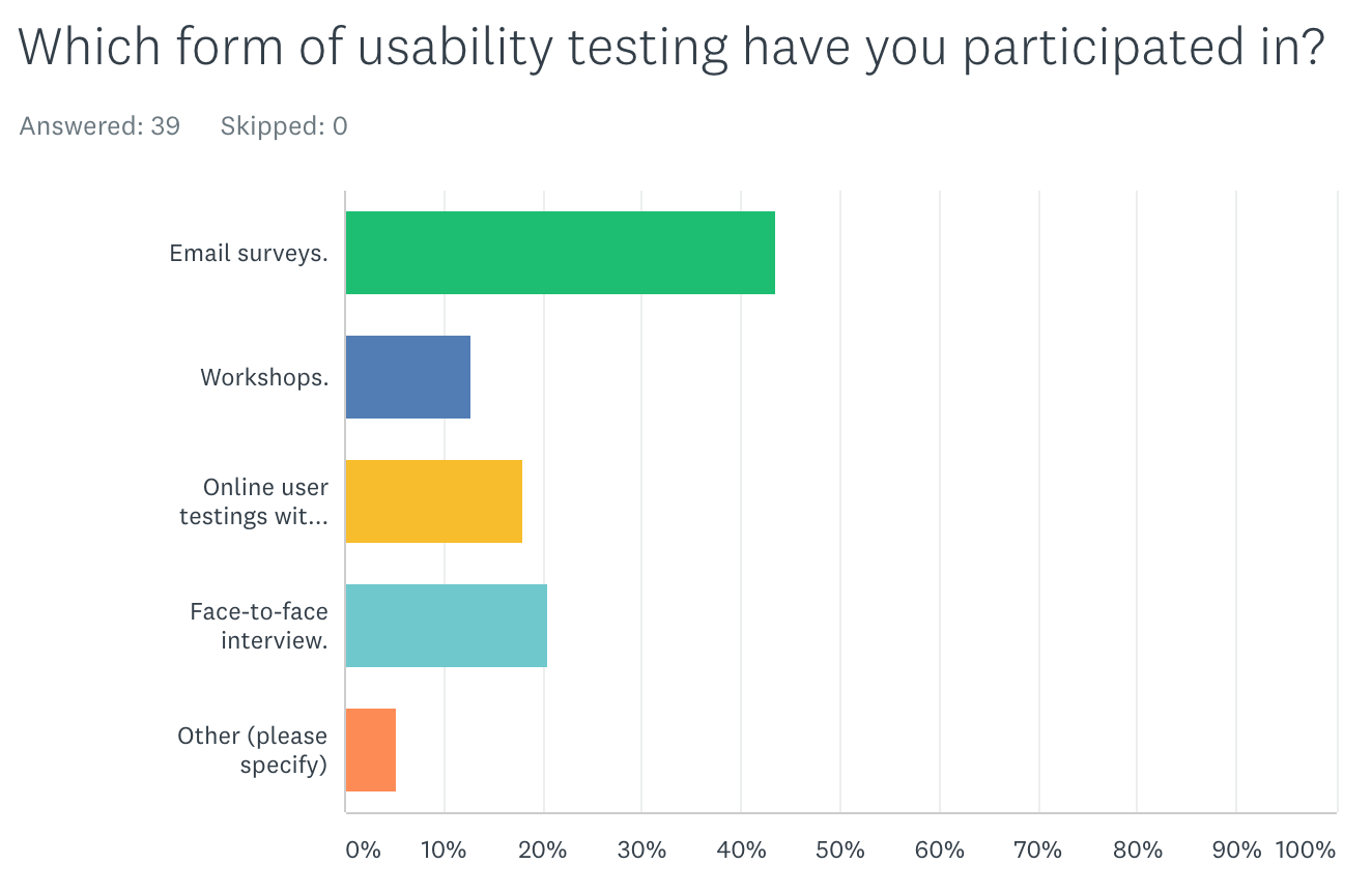
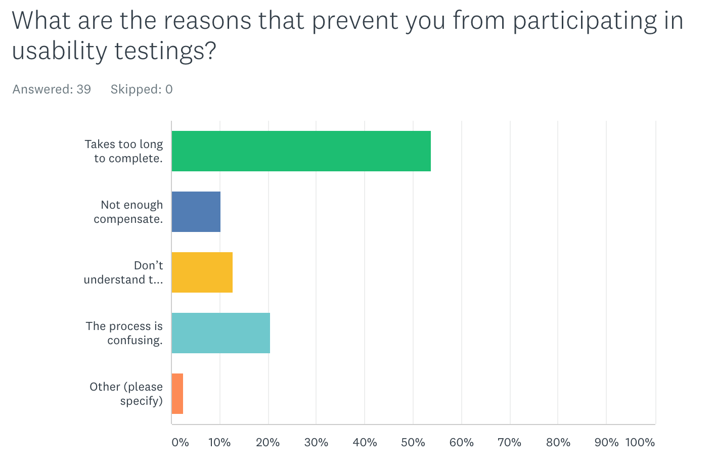
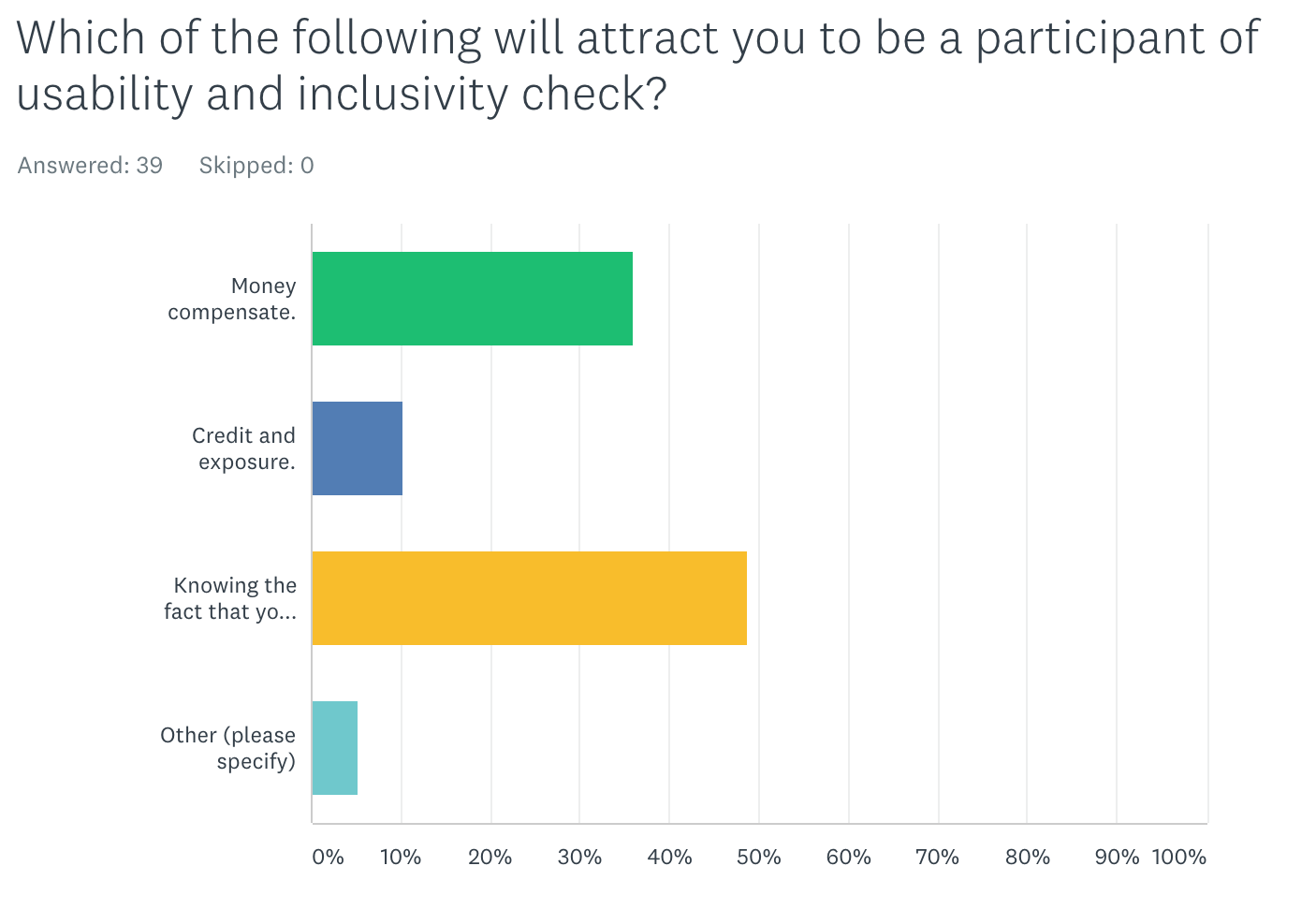
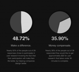
I sent out an online survey to students in Emily Carr University who is in different year and major. I also sent them to facebook to get to know a wider range of participants. Because I did not count their age group, gender, job title or any private information, so the result is very vague.
Understanding the 39 online survey answers in relation with my in-person interview with 3 Emily Carr Students, I got the conclusion of the biggest motivation for people to participate in user research is because they want to improve their own experience of using the product.
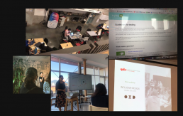
Other than formal interview, I joined workshops and event during the semester to expand my network and research my topic. Those workshops and meetups allows me to connect with people in the industry including designers, business owners and researchers. I am able to chat with them about my project, I gain new perspectives and got to know how the industry is doing user research and what will be valuable for them.
Solution
I spent times to think around the ethical problems in design world, and I want to share my voice by focusing the features of the project closely related to connection building as a new perspective of user testings.
People who are interested in giving feedback to an App will register as participants, they will have different tests recommended to them based on their profiles. When they complete a test they will grant an impact point for that company, they can use these points to exchange products.
If a company want to use my website to gather user feedback, they will first register themselves as Researchers. They will be able to post each testings as a recruiting post with participant requirements and selected incentive method (either privately or on platform). They can also choose to contact participants based on their approval. If they have an ongoing relationship developed with a participant, they can get more direct feedback.
Reflection
This project has been a project for me to grow and explore, finding my true passion and career path as a designer. During my design process, I found interesting perspectives, I want to keep exploring the relationship between users and designer as a future thesis. In the future, I want to explore more design solution around understanding the meaning of user testings and thinking more about design ethic in their design works.

ABOUT KATHERINE ZHANG
An interaction designer graduated from Emily Carr University, dedicated to create visually pleasing designs while focusing on inclusivity, meaningful impact and emotional connections.
Passion lies in creating human and earth centric design solutions for contemporary problems. Always looking for fresh insights while exploring possibilities.
http://www.katherinexz.com
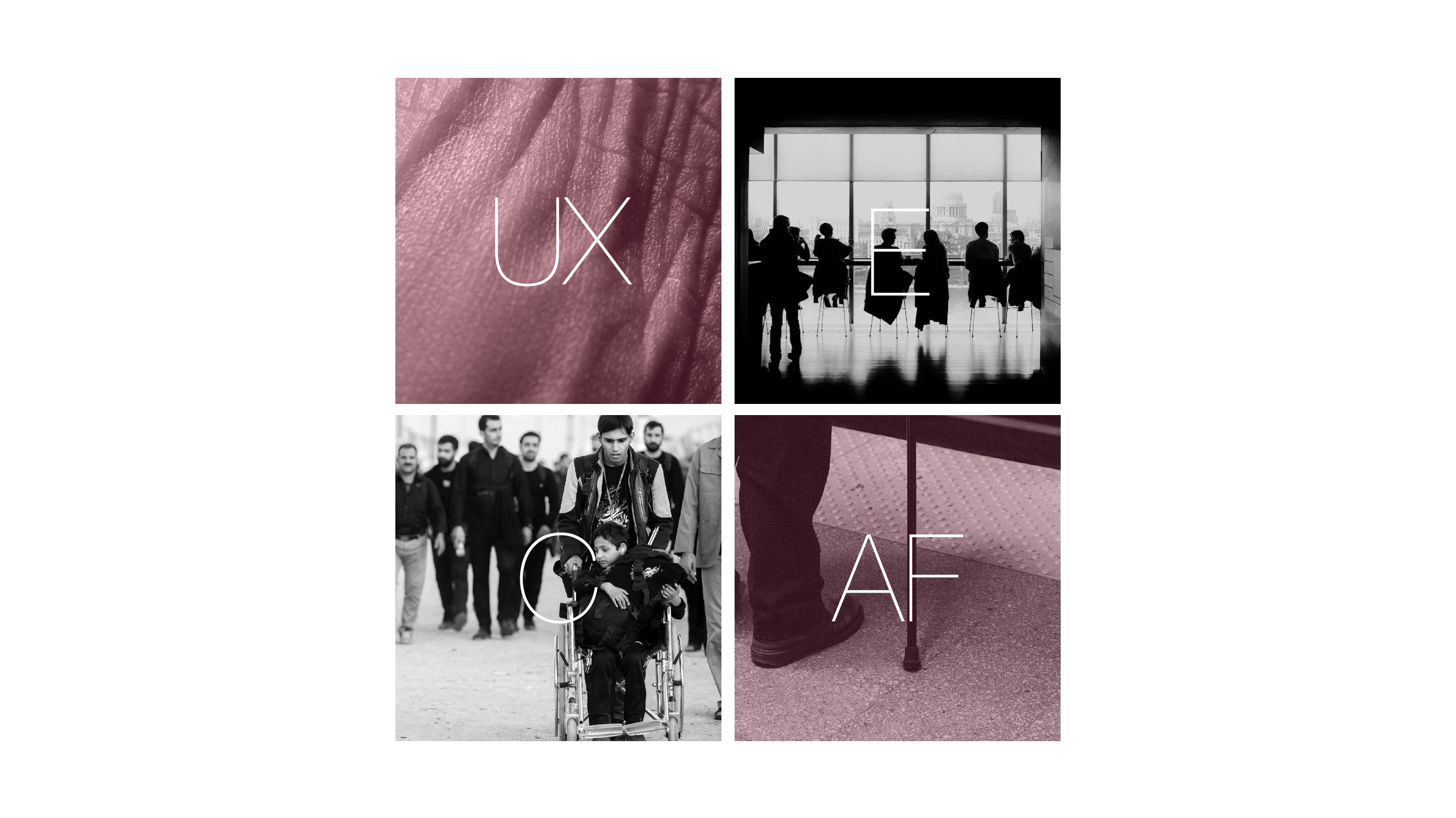
IRIS | IGNACIO BARBOZA
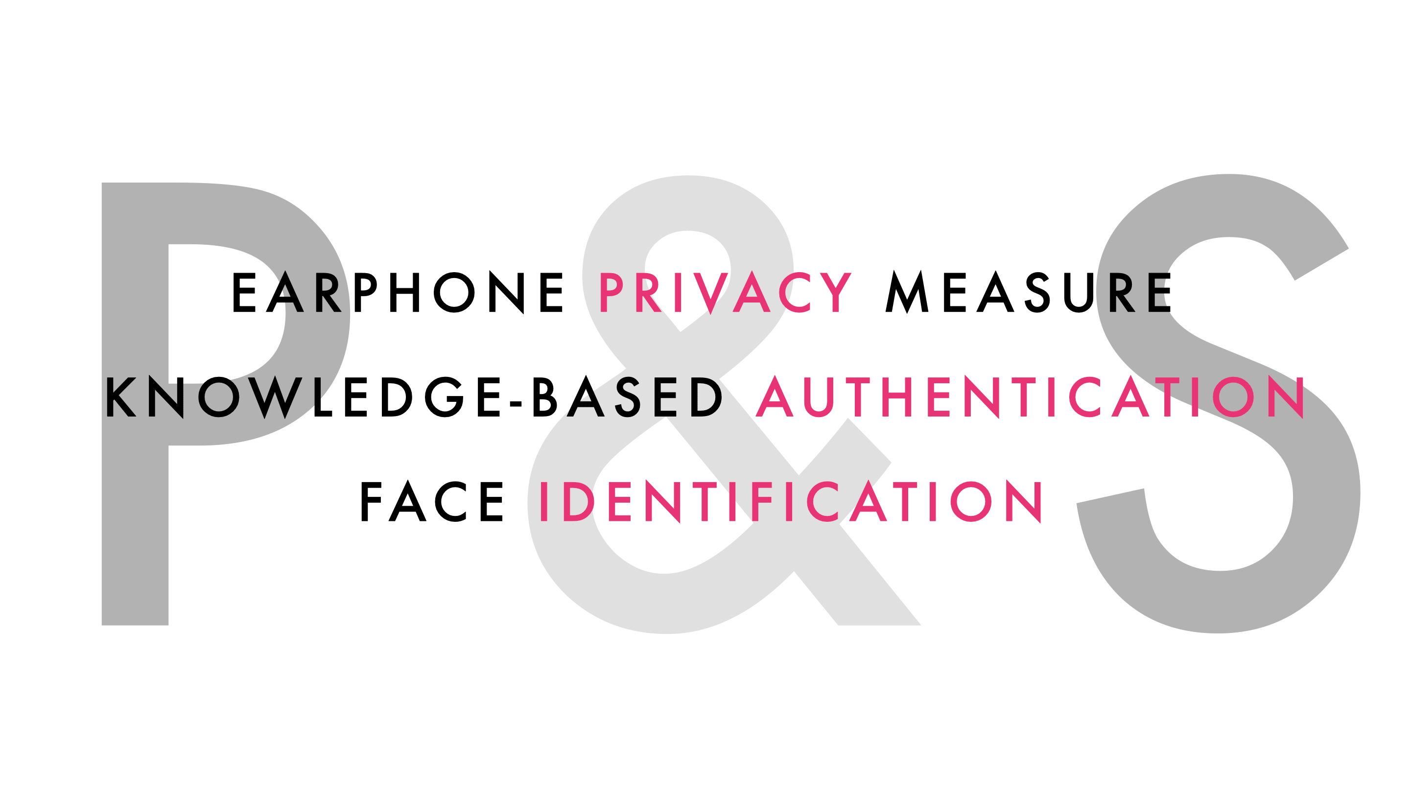
IRIS is an online system that provides a user-friendly, accessible auditory interactive layer for sites of banking institutions. The inclusive system allows for a secure and private experience by incorporating web knowledge authentication, Face and Touch ID. IRIS takes advantage of emergent technologies like voice user interfaces and will ultimately incorporate the latest artificial intelligence software.

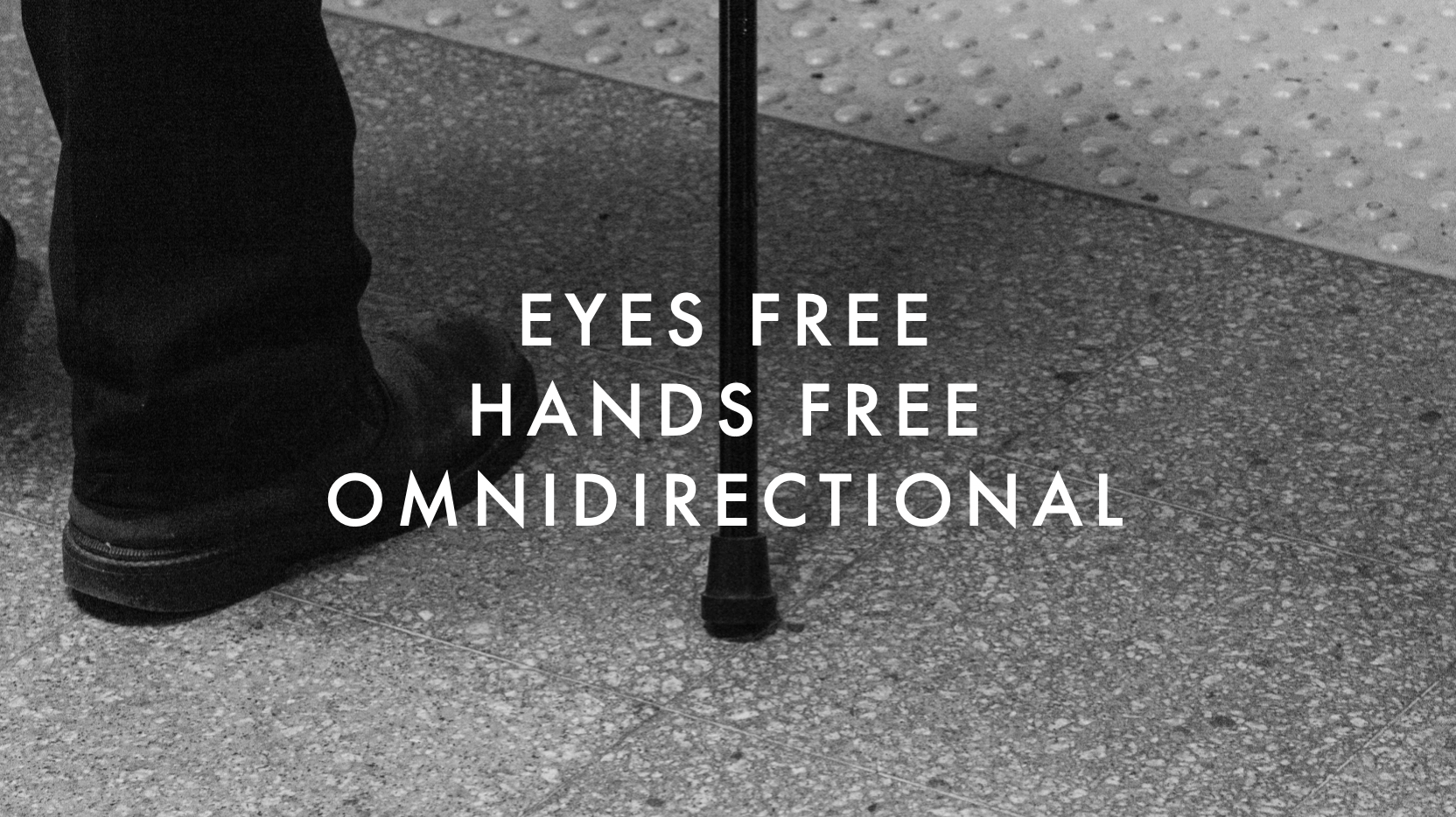
IRIS VISION
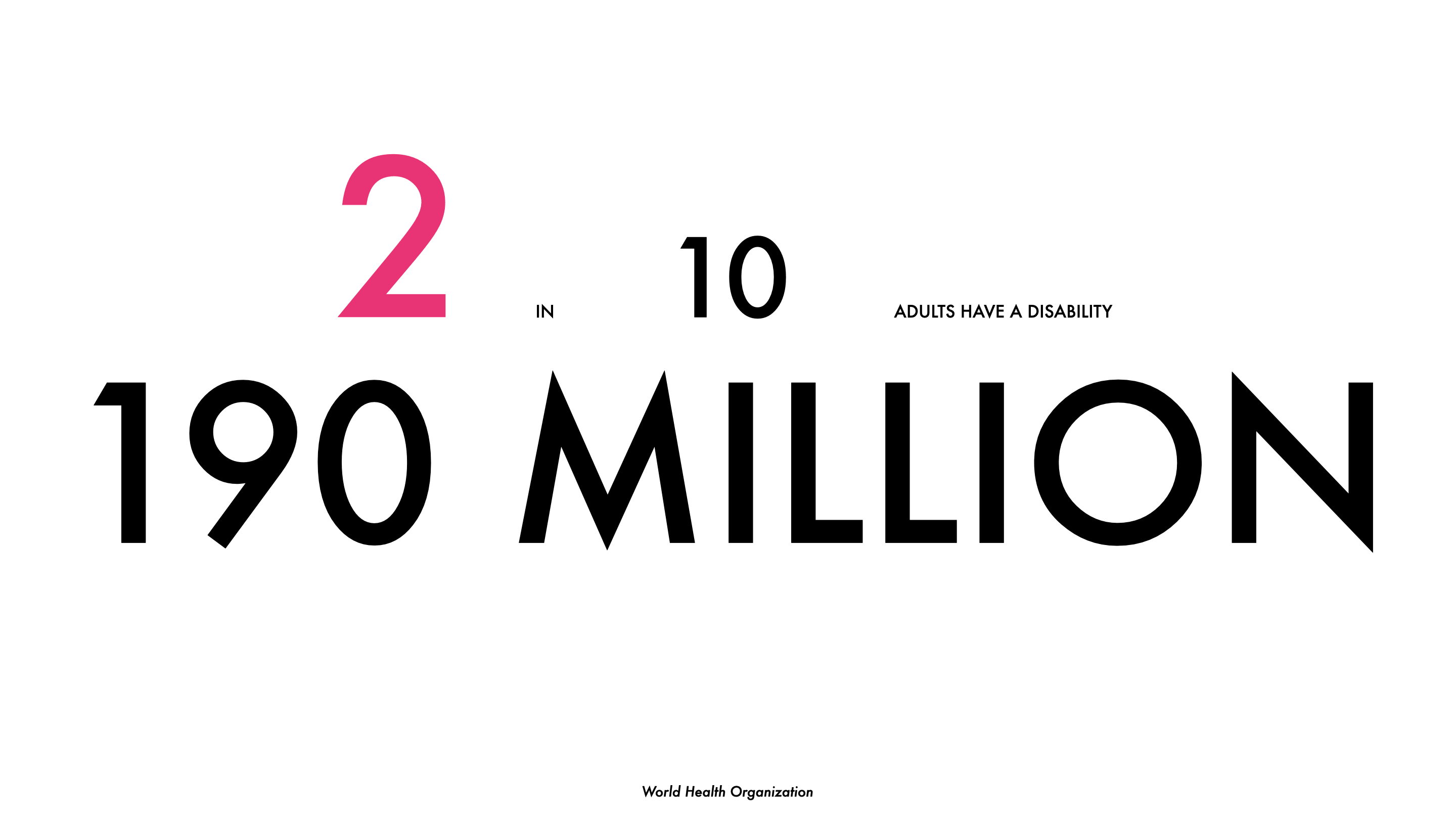
As a child growing up I’ve always questioned how my uncle Marcus perceives the world. He was born with a vision disability in the late fifties in San José, Costa Rica and with limited access to technology, medical, psychological and pedagogical advancements, his life hasn’t been the most lenient. Nonetheless, he’s one of the happiest individuals I’ve ever met.
This is my story of how User Experience Design can raise the technological bar for the promotion of independence and inclusivity for populations living with visual disabilities.
How can design and biology merge to improve the quality of life of its users and enhance human interactions by creating dignified experiences?

IRIS PROCESS
The framework of the IRIS system is constructed upon four main pillars, user experience, accessibility features, employment, and community engagement. Through the applicability of user experience design tools, IRIS reduces the friction between design and disability and incorporates accessible features that are embedded into its operational system.
PRE-STUDY
As part of a pre-study, diverse interviews were done with experts in the field. This phase of the study was done in collaboration with an organization called “Nueva Luz” which is based in San José, Costa Rica.
Additionally as part of the pre-study, and before the user testing was held, several interviews were carried with Cirsa Alvarado, the director of the User Experience Design team at BAC International Bank. Alvarado is responsible for UX strategies in Latin American.
Diverse questions were sent concerning the inclusivity initiatives and programs that the bank runs at a regional level. An analysis of the different digital channels was done and it was concluded that users with vision disabilities don’t have the same access to these platforms as sighted people. A chart was created to understand the different limitations in Digital and Non-Digital services based on the different types of disabilities.
USER DATA ANALYSIS
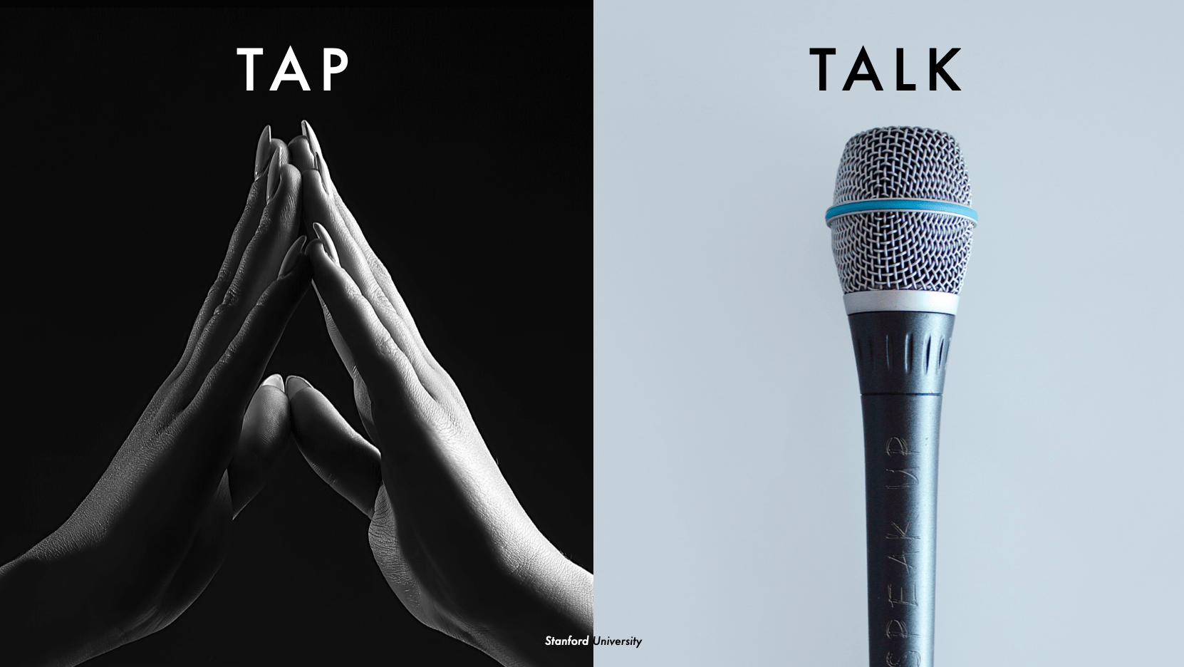
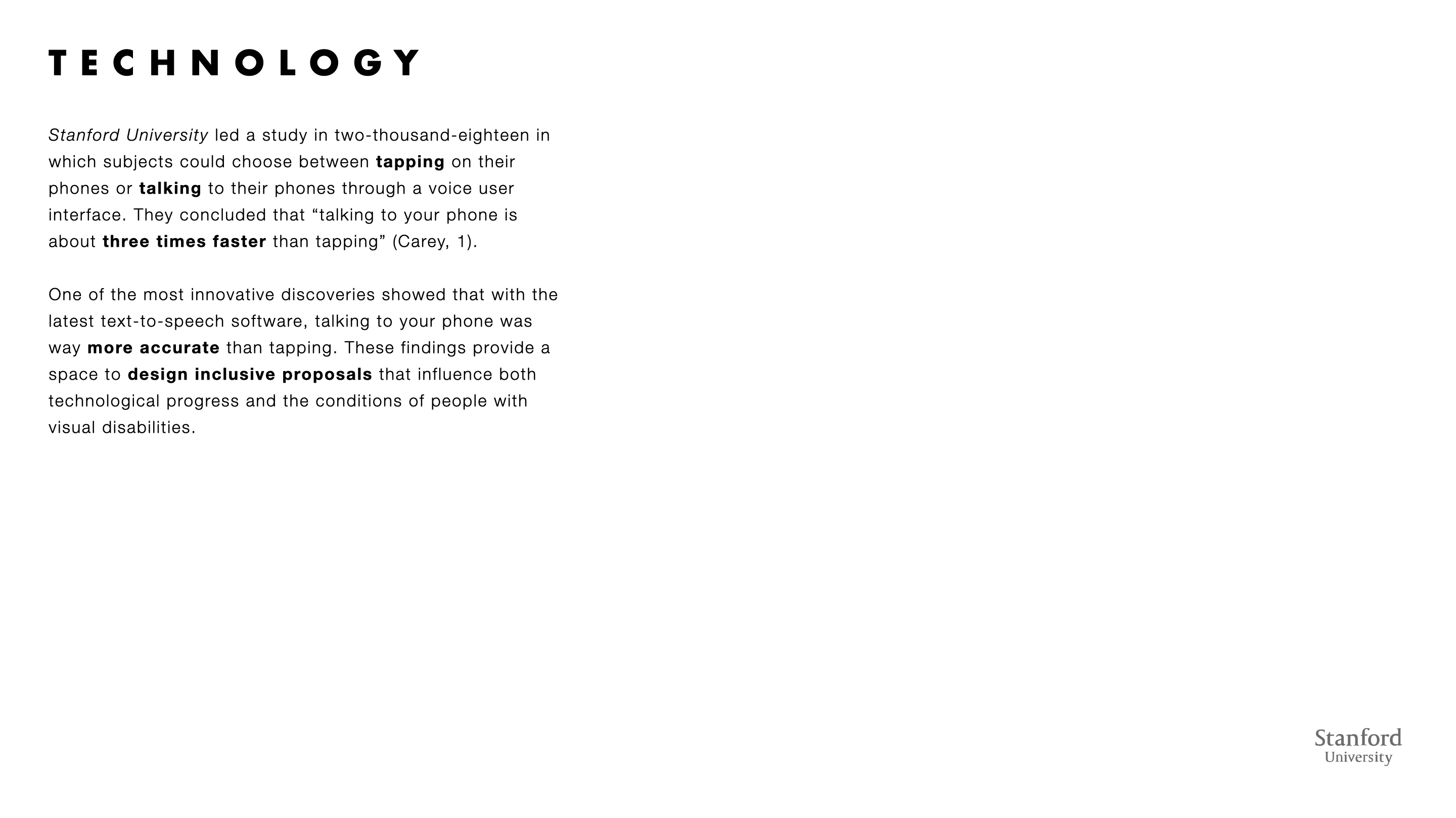
During the work, an analysis of interviews and user testing was held with users with visual disabilities. The primary objectives were to investigate the contextual auditory information regarding financial transactions, an exploration of the existing digital tools that are currently being used and the possibility of the implementation of voice user interfaces. The findings of the study concluded that multimodal interfaces expedite the process by combining voice, haptics, and quality visuals.
The process of the interviews started with a transcript that served as a starting point for the user data analysis. Later, the most relevant feedback was written down in post-it notes and different thematics were drawn in terms of similarity. The thematics were drawn by chronological order depending on the interviews that were carried.
THEMATICS
It was concluded that the following thematics were predominant in almost all the interviews:
- There is a difference between users with low vision and users who were born blind.
- CVUIs should be able to accommodate in the visual disability spectrum, giving the users complete independence and control over the different functionalities.
- Using CVUIs is not ideal in public spaces.
- Privacy is always a barrier when using online tools.
- Security measures that are currently being implemented are not user friendly or inclusive.
- Some online platforms don’t follow accessibility norms like the “Accessible Rich Internet Applications (ARIA)”
- Some security measures have a time constraint, which in some cases, is not compatible with screen readers.
- Online platforms are usually not user-friendly with screen readers. Users require turning them off, switching their phone settings, etc.
- The visual navigation of newer online platforms is initially hard to learn.
- Users learn to navigate from A-B and B-A.
- A linear navigation method would be the most ideal and inclusive
The goal of this qualitative study was to identify and understand the pain points of users with visual disabilities regarding their administration of personal finances. Moreover, empathize with how they’ve attempted to relieve their struggles with existing tools and gather insights about VUIs and haptics.

CONCEPT
FUNCTIONALITIES
Through the analysis of data, conclusions were made per different concept functionalities. The future iteration of the concept can accommodate different types of visual disabilities, incorporating a multimodal function with a haptic system of voice, vibrations, sounds, and high-quality inclusive visuals.
Since some users indicated that they had low vision, feedback will also be included taking into consideration the use of visual interfaces. IRIS is designed inclusively for users with low vision following the “GOV.UK, Home Office Digital, Data and Technology (DDaT)” guidelines. Originally, the layout of the screens was designed with a high contrast mode, bold and readable text. The system also applies a combination of colors, shapes, and text and follows a linear logical layout. Buttons and notifications are put in context.
In the case of users with no vision at all, the system runs solely on voice, sounds, and vibrations. The users are provided with an integrated auditory feedback like the sound of a piano key indicating a successful transaction. If a user is stuck or needs to go back in the process the user is instructed to give a verbal command for the system to repeat itself or go back several steps.
CONCEPT STRATEGIES
IRIS is a cloud-based service that allows for the development and design teams to work on it on the fly with bug fixes, updates, and service expansions. The marketing structure of the service is shared with more than one financial institution making a split development cost.
The system is designed to be marketed with a Year One Exclusivity by giving the first banks that acquire the service exclusive pricing. The license of the system is sold as a Monthly Subscription, including service & maintenance costs, making IRIS innovative and inclusive by raising the bar of user experiences in the banking fields.
USER JOURNEY
IRIS service is mapped out in a user journey to demonstrate the vision of the project by communicating the possible concept stakeholders, user pains, needs or possible outputs. The user journey also served the purpose of identifying functionality levels, dependent on the level of visual disability. This User Experience tool helped define user flows and the overall information architecture.
FUTURE
The proposed concept would be satisfying to be executed in the future since it would eventually become a very necessary technological solution for populations with visual disabilities, and a design breakthrough that would make me feel personally accomplished.
IRIS will create autonomy, independence, and inclusivity for a population that has been excluded from dignified digital experiences. Having the empathy to understand the struggles that people with disabilities face day-to-day ignited the need to design for those in vulnerable conditions. I felt driven to use my design skills and talent to create a platform that facilitates the banking experience for so many users. IRIS will change and enhance the quality of life with its vision of User Experience Design.


IGNACIO BARBOZA
Ignacio Barboza is a UX / UI designer currently based in San José, Costa Rica. He designs for private and commercial projects within the digital realm and incorporates interdisciplinary practices.
With an educational background in London, England, and Vancouver, Canada, Ignacio designs UX solutions that often improve the quality of life of its users.
Producing empathetic experiences, Ignacio’s work situates in a unique space by having a personal engagement with inclusive design, design for disability and health design. On-brand, deeply rooted in hot Latino flare.
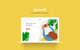
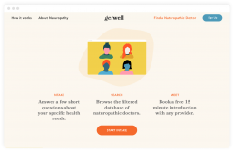
Get Well | Bronwyn Proctor
Find a naturopathic doctor, meet with them remotely, and manage your records, completely online.
Scroll and click through the Get Well prototype above.
The Need

More and more people are choosing a more integrative approach to healthcare, and the complementary and alternative medicine market is growing fast. The market size is estimated to be $296.3 billion by 2027, and within that, naturopathy is one of the fastest growing therapies over the past two decades.
Virtual care, also called telehealth, is all the ways doctors interact with their patients remotely. The Canadian healthcare industry is looking at ways to shift towards providing more virtual care options. This focus will help to provide faster access to health care, and meet patient demand specifically for virtual healthcare.
We know the market is growing, more and more people are seeking out naturopathic care, but the discovery and delivery of care is not as accessible or convenient as it could be.
Searching
Finding a naturopathic doctor can be a confusing process and there is no easy way to try out a provider before committing to an expensive initial visit.
Location
Your provider choices are limited by location. If you want to see someone with specific experience, or you live in a remote area, accessing care becomes difficult.
Records
Delivery of documents and records from practitioner to patient are often not digital, or buried in email attachments. Keeping track of your own wellness progress can be overwhelming.
The Solution

Get Well gives patients of naturopathic care everything they need in one place. Find a naturopathic doctor, meet with them, keep all your records organized – all in one place.
Complete an intake questionnaire and choose from a filtered selection of naturopathic doctors.
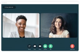
Meet with your naturopathic doctor virtually with video, audio, or text visits.

All your records are organized and safe in your patient portal.
Reflection
As I was wrapping up this project, that I had been exploring for eight months, the world changed in a big way. When I started researching and interviewing people about virtual health in 2019, many people weren’t sure what it was. Some services were beginning to become available for conventional medical services, but there were definitely no options for complementary or alternative healthcare.
Now, with this global health crisis preventing people from accessing their chosen healthcare regularly, many practitioners are looking for new ways to continue to care for their patients.
While this period of time is mostly difficult and overwhelming, I’m excited about the future of health and wellness, and I’m excited to keep working in this field of design.
ABOUT BRONWYN
I believe design is about understanding people and their needs. I’m continually trying to reflect this belief in my work, and keep empathy at the core of my process.
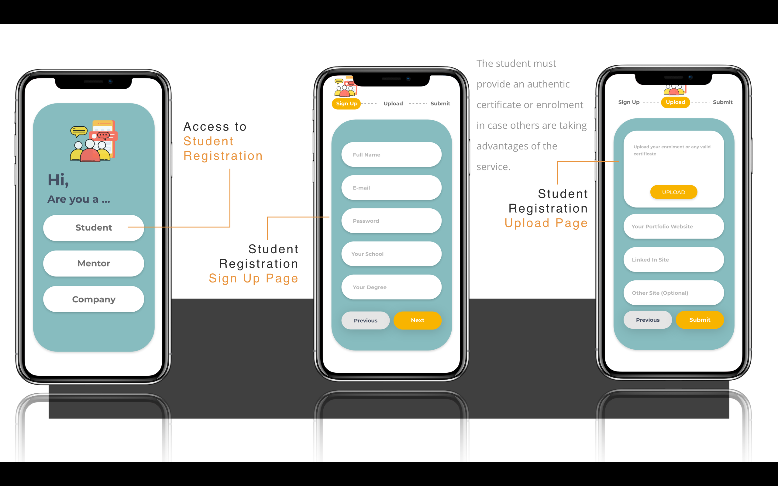
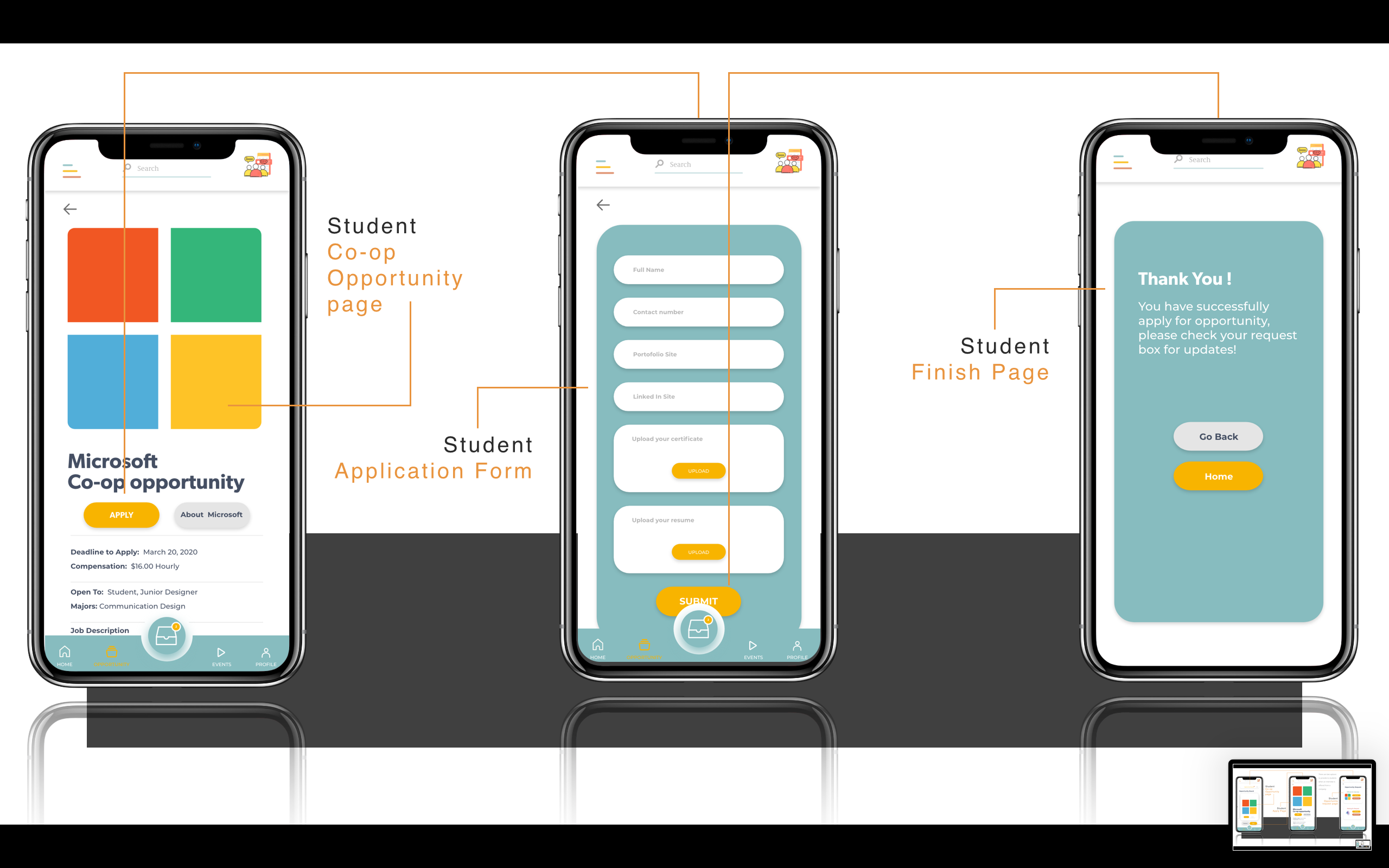
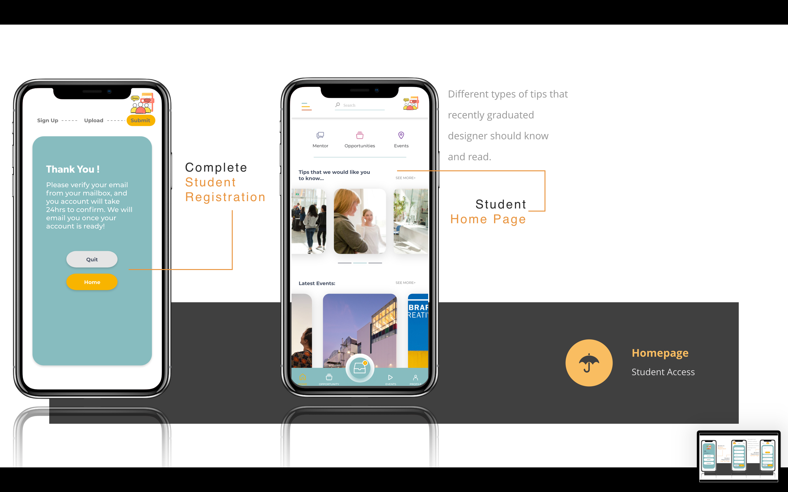
Leadder | Janice Chen
What is Leadder?
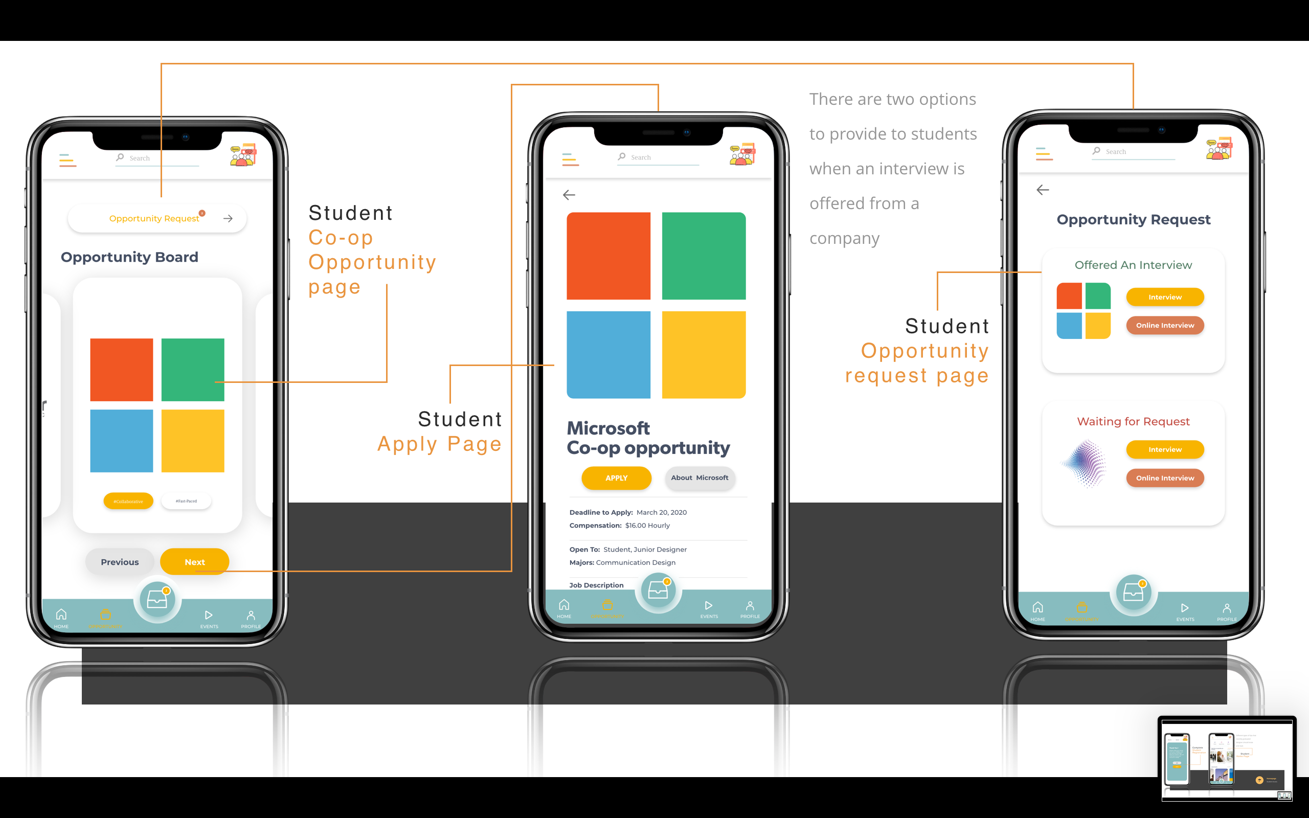
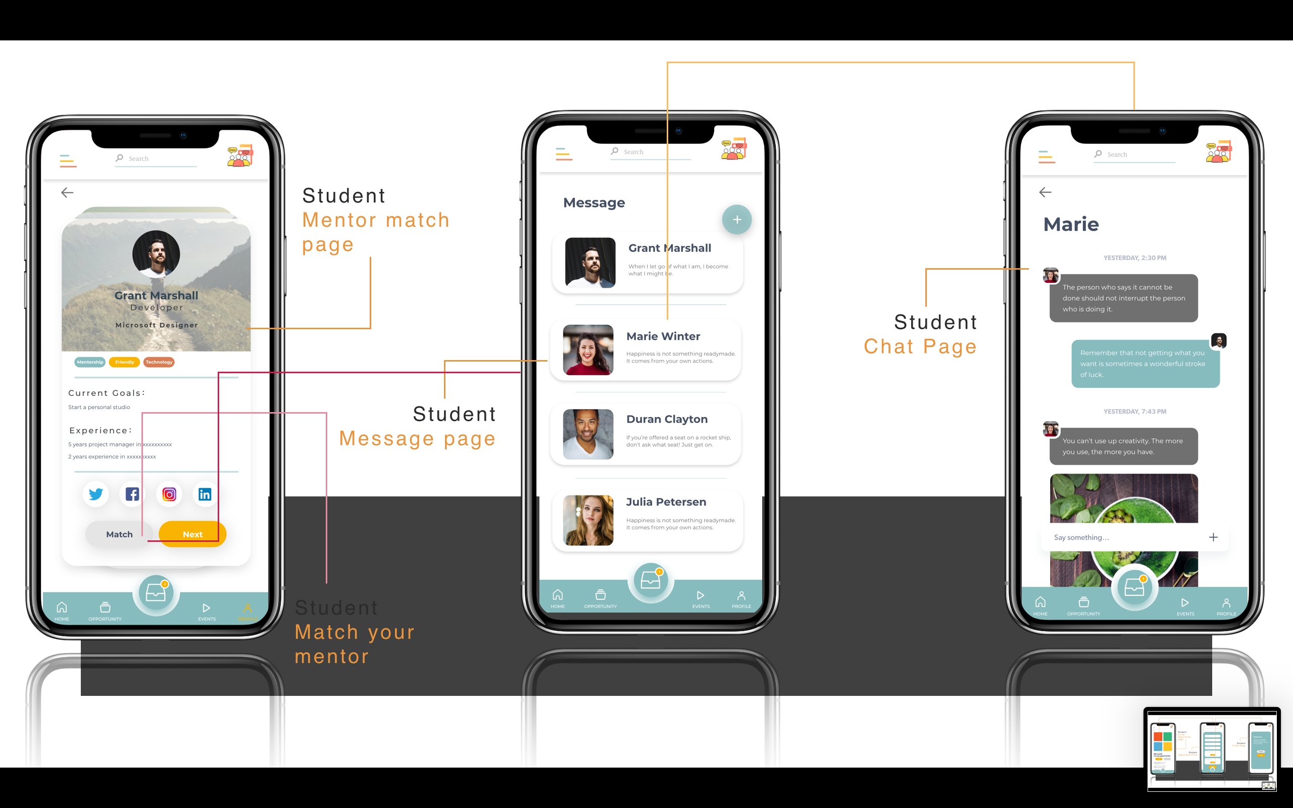
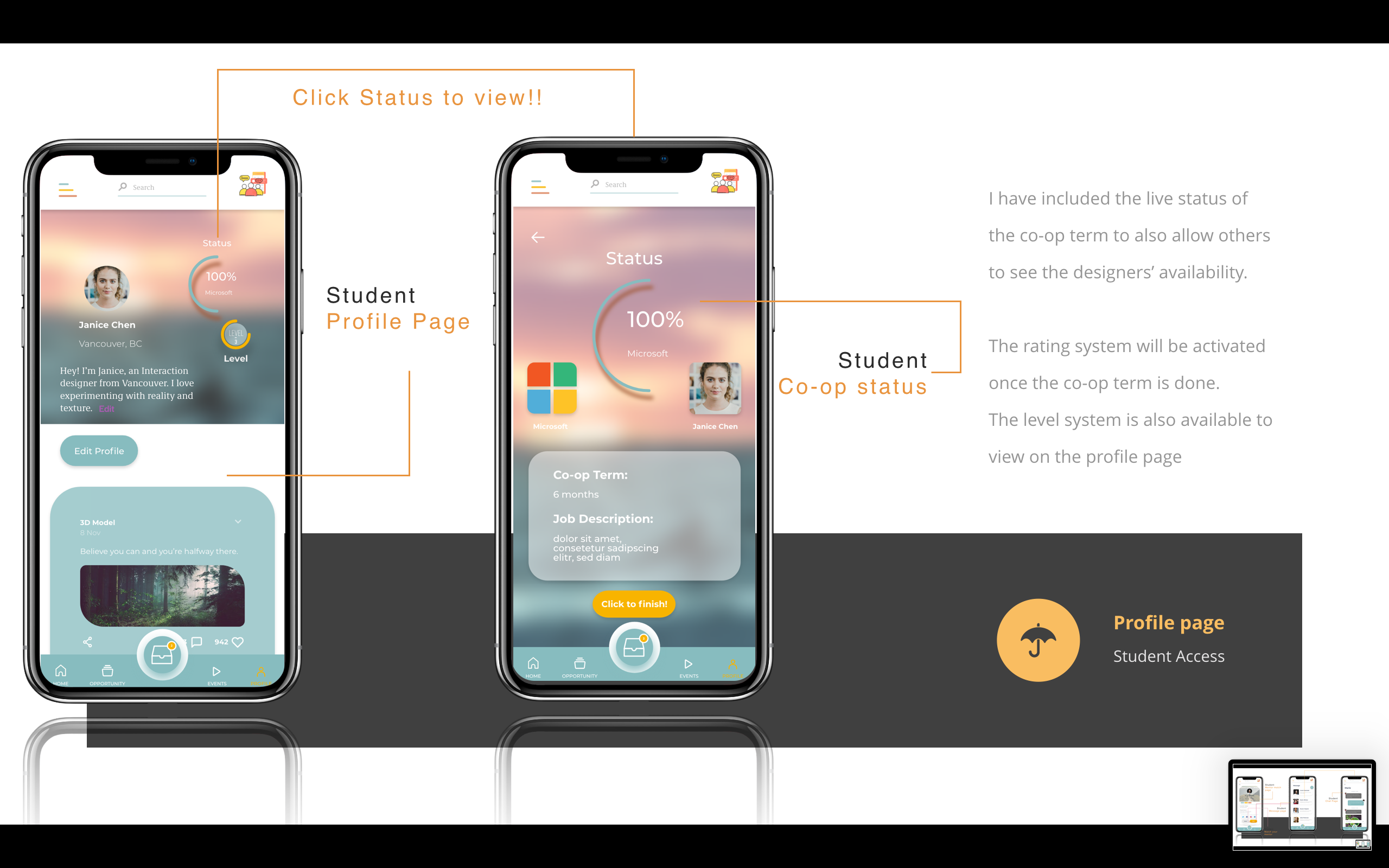
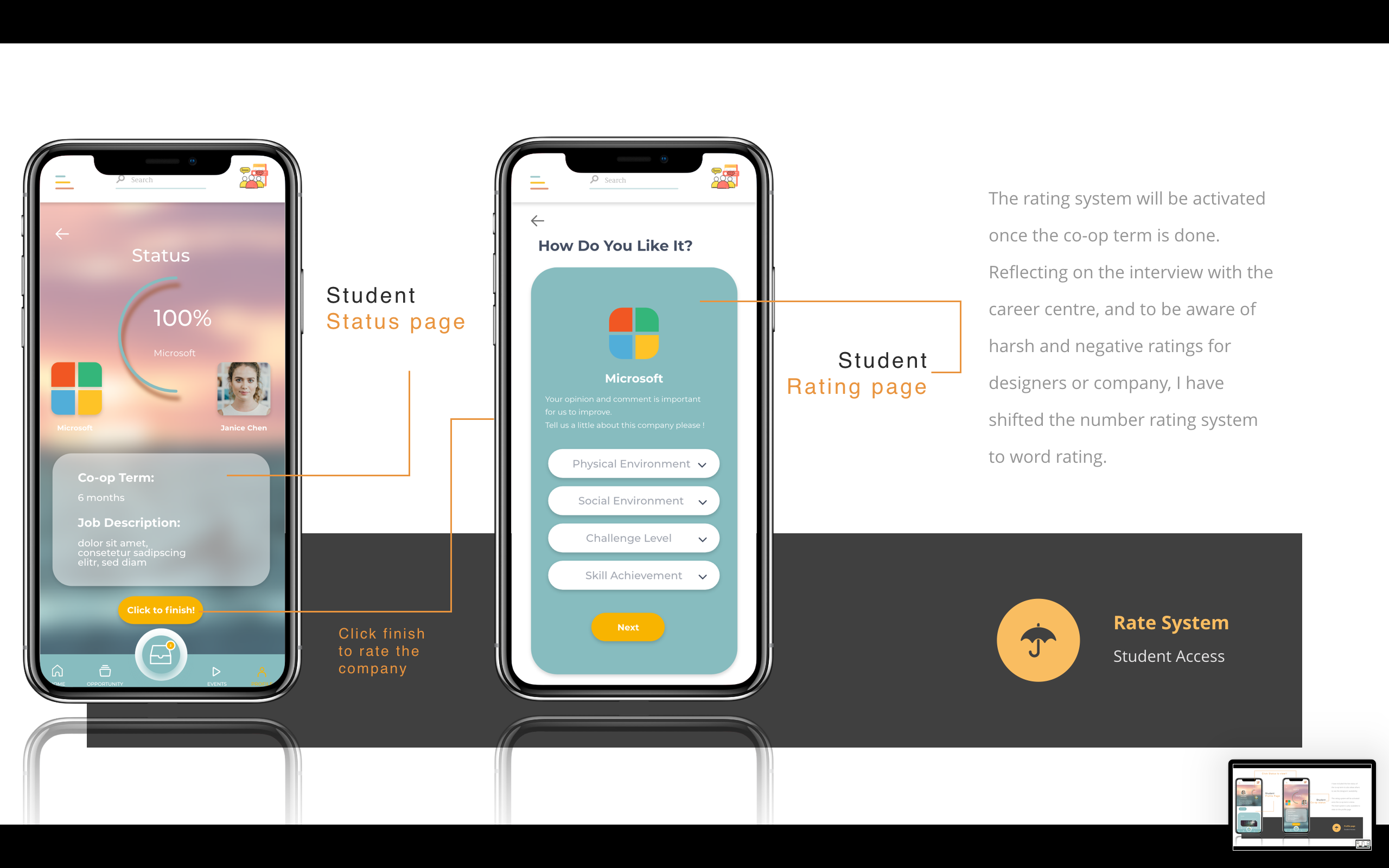
“Leadder” is a phone application to create a community mainly for both junior and recent grad designers to build up design skills and work experiences at the same time. It is to provide companies a high-quality design, with an acceptable budget to clients by having a mentorship system. The phone application will be mainly targeted to recent grad designers, schools, and companies to provide an opportunity space for them to look for help and job opportunities while shifting themselves from a student to an entry designer. This also gives them an opportunity to look for a team for any individual work through the features that is provided by Leadder such as the mentor and co-op system; which increases the level of satisfaction between recent graduate student designers, schools, and companies.
Opportunity Space
This application is intended to guide students to start seeking help and co-op opportunity to find their way out. By creating the phone application, I hope either to make it as a plug in update or application for school use purposes to benefit both school and recent grad students. It is to reduce the chances of students having great portfolios but bad skills, reduce the chance of mismatching job for students, and also to encourage students to be more proactive by providing them a starting point to start with in the co-opportunity.

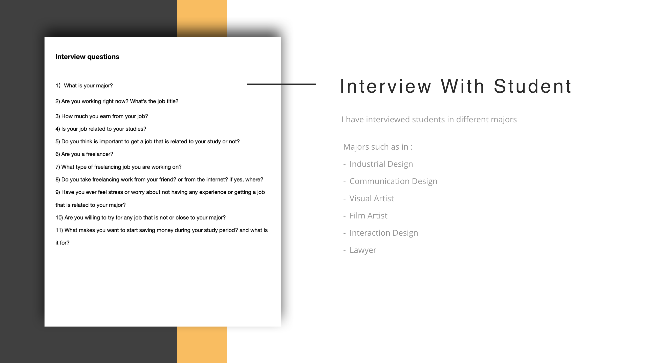
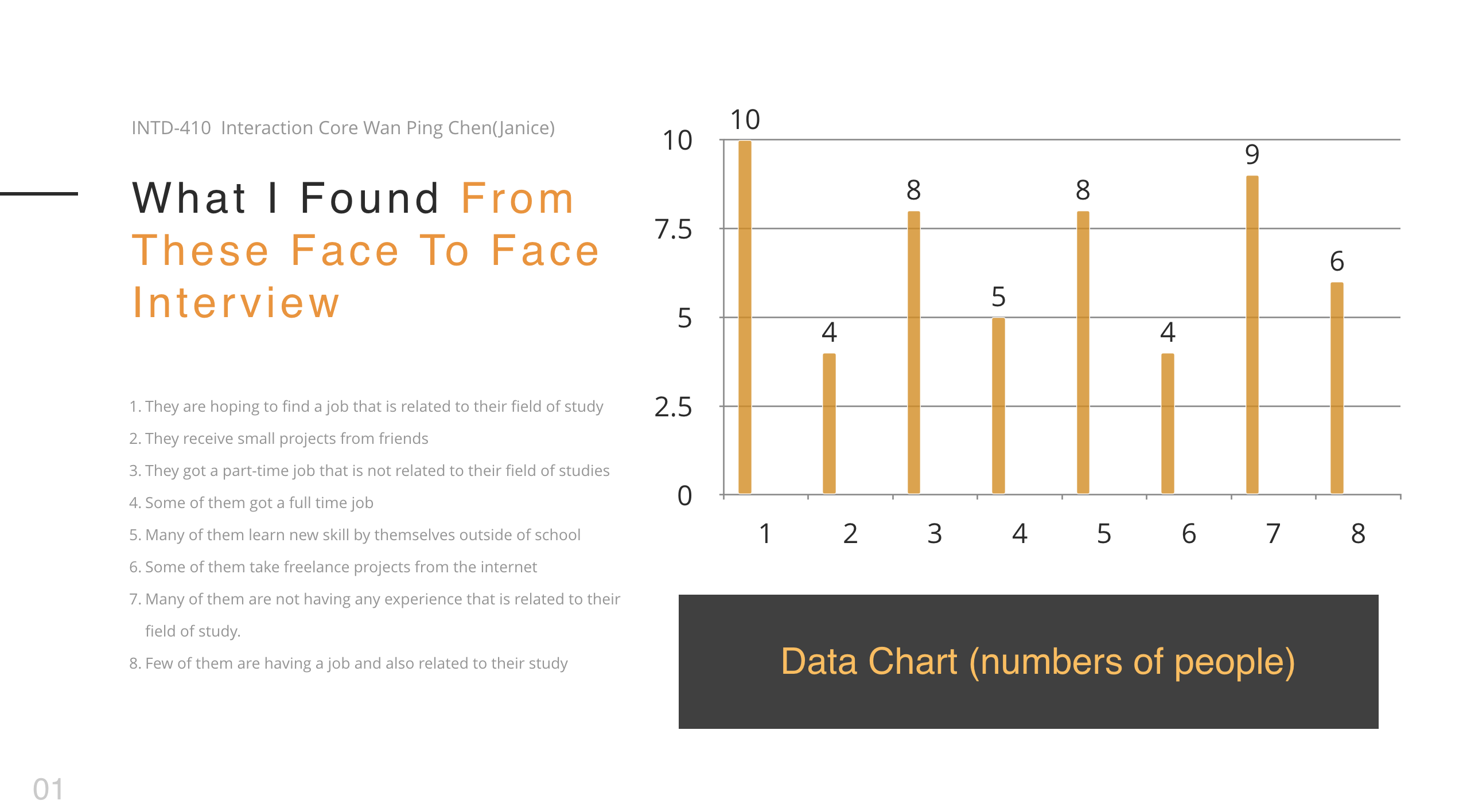
Research
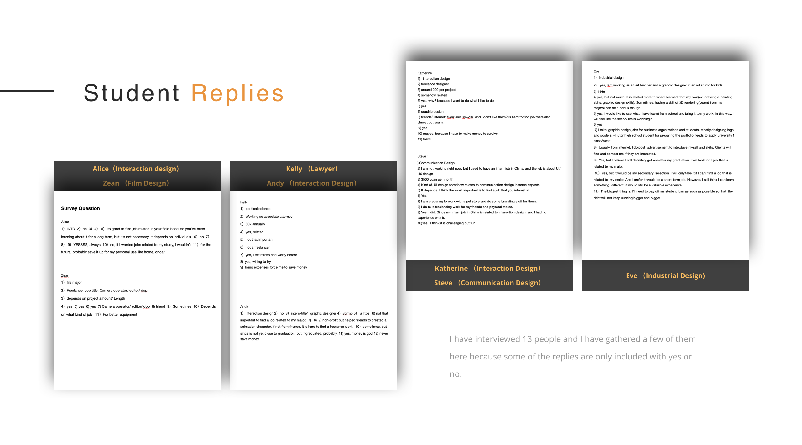
I have interviewed with students in different design fields and majors: industrial designers, communication designers, interaction designers, film artists, communication designers, visual artists, and lawyers.
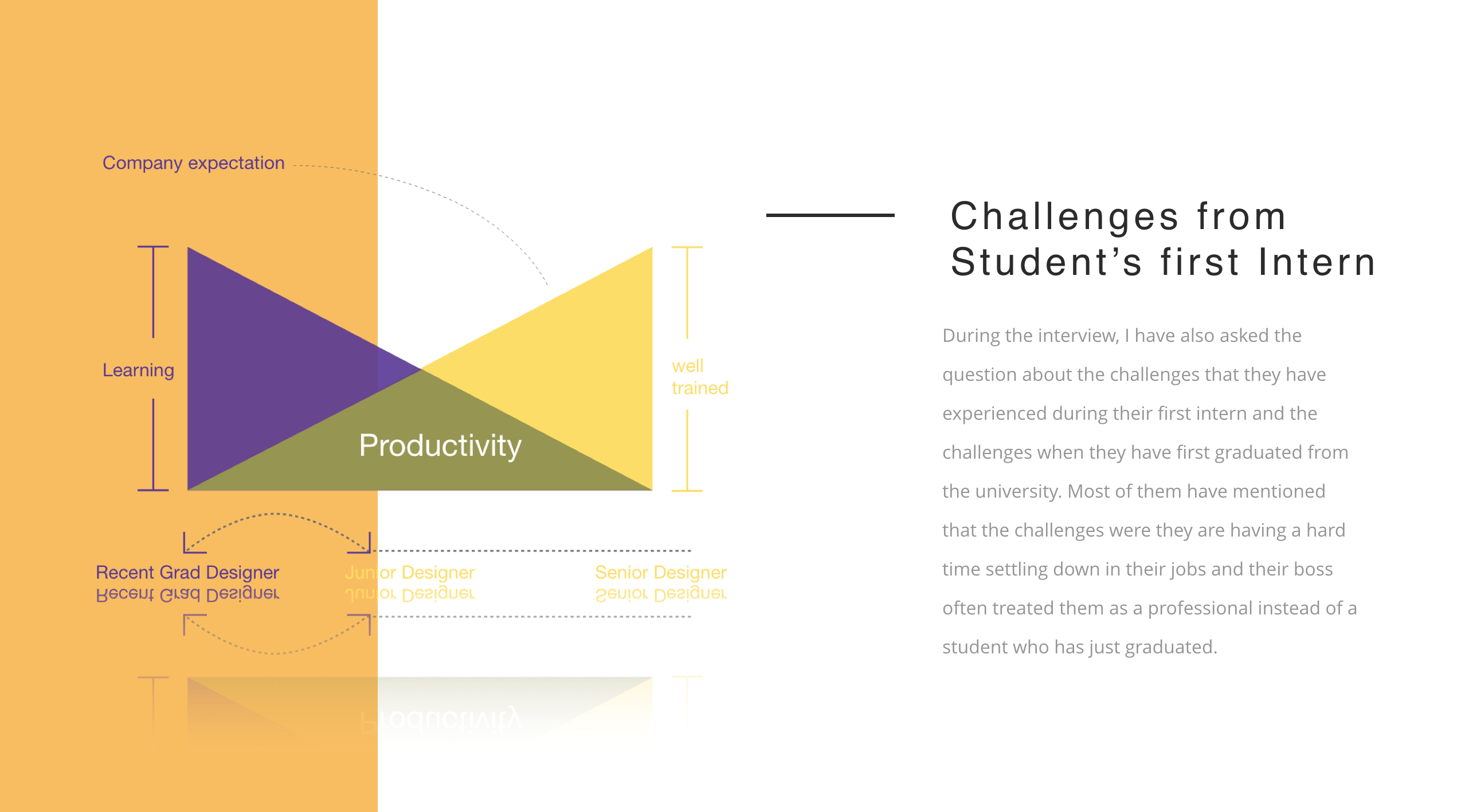
I was having a hard time looking for mentor help or any professionals that I can interview with. After talking to the Instructors, they have recommended me to interview with the career centre. I have finally decided to interview the career centre since they have provided services that are similar to my final idea.

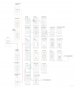
Clickable Prototype Link
Feel Free to try the prototype for Leadder
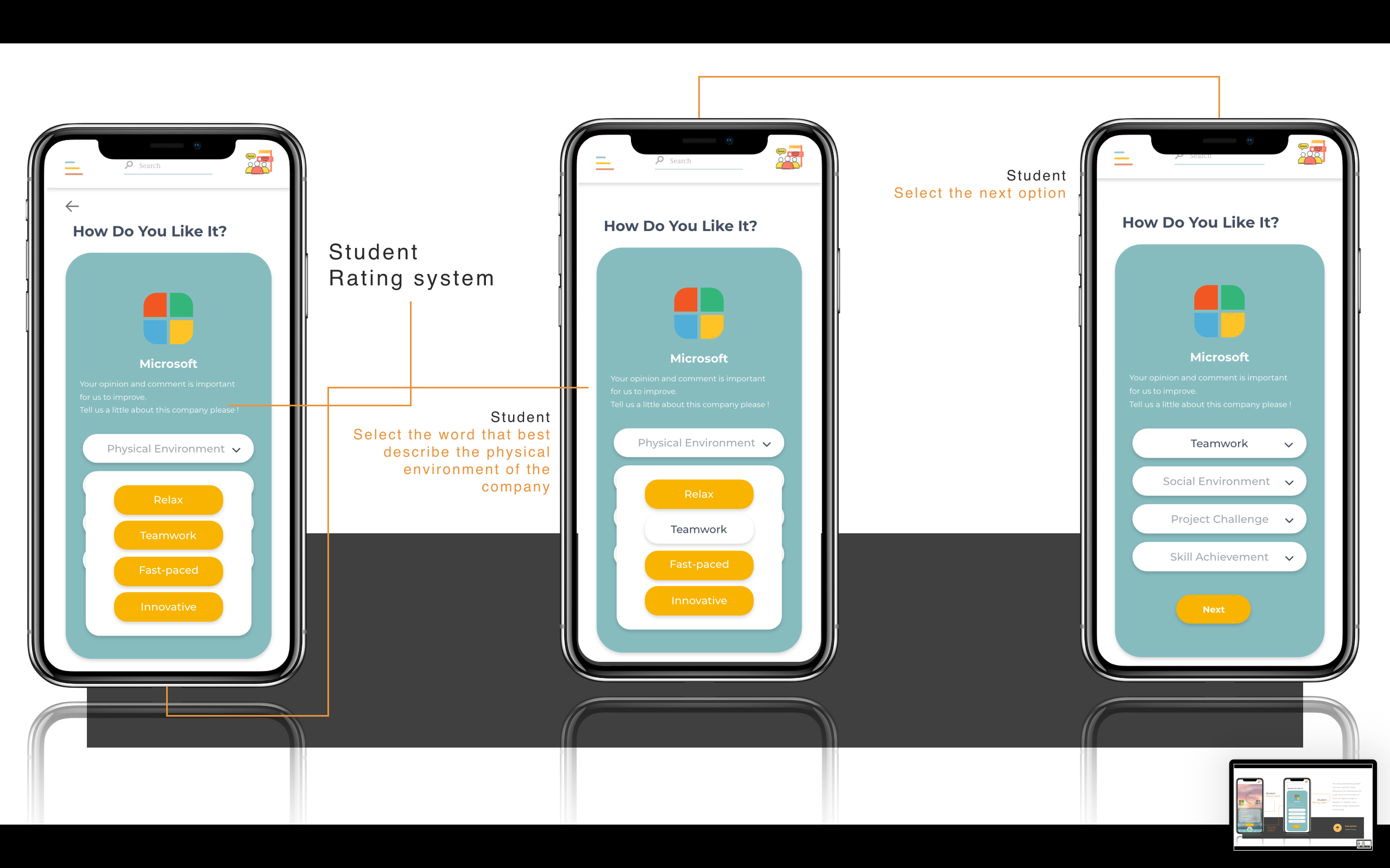
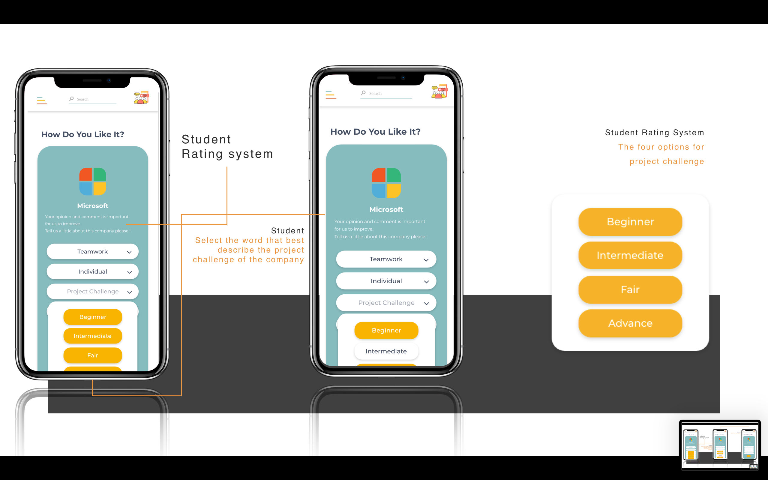
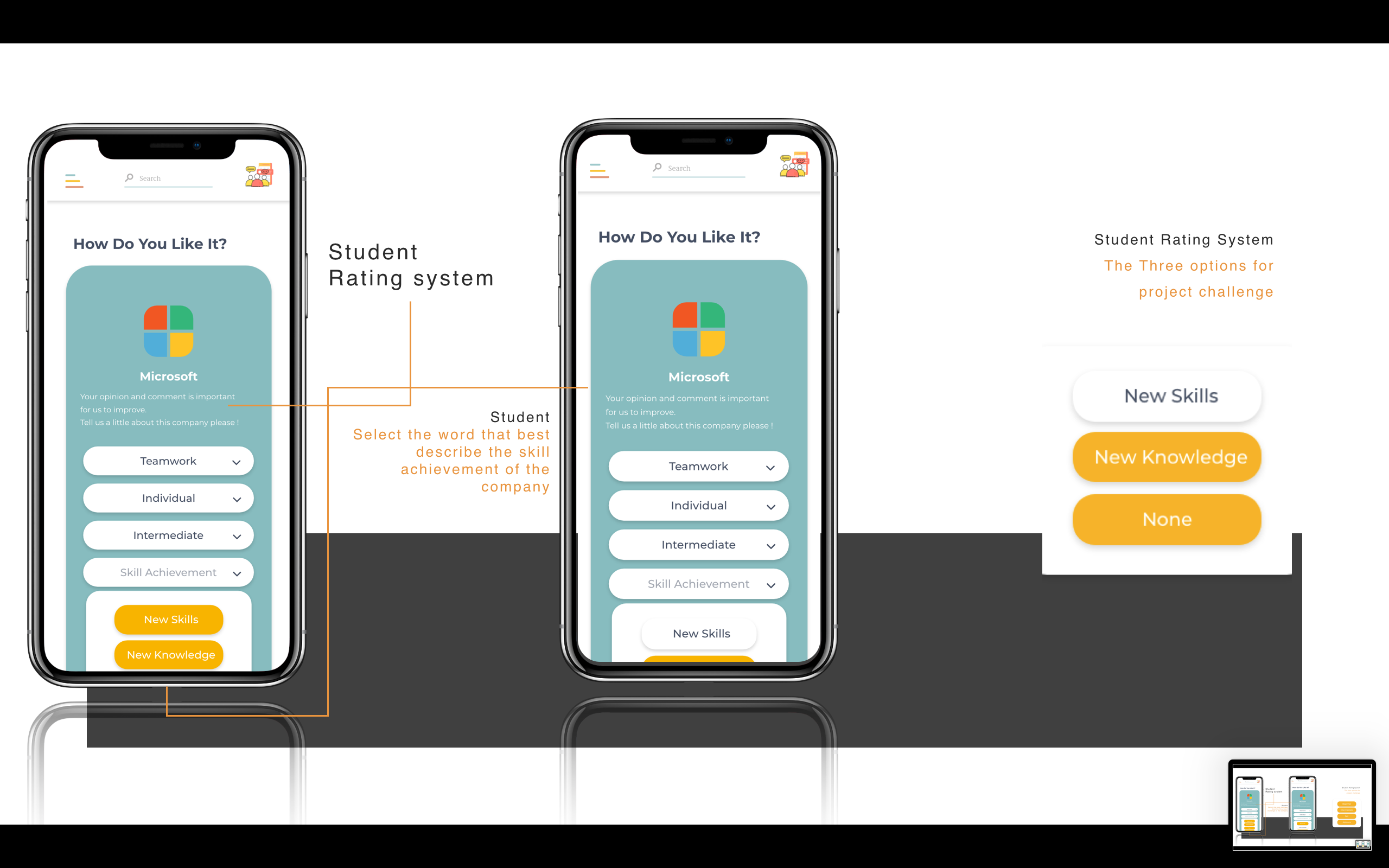
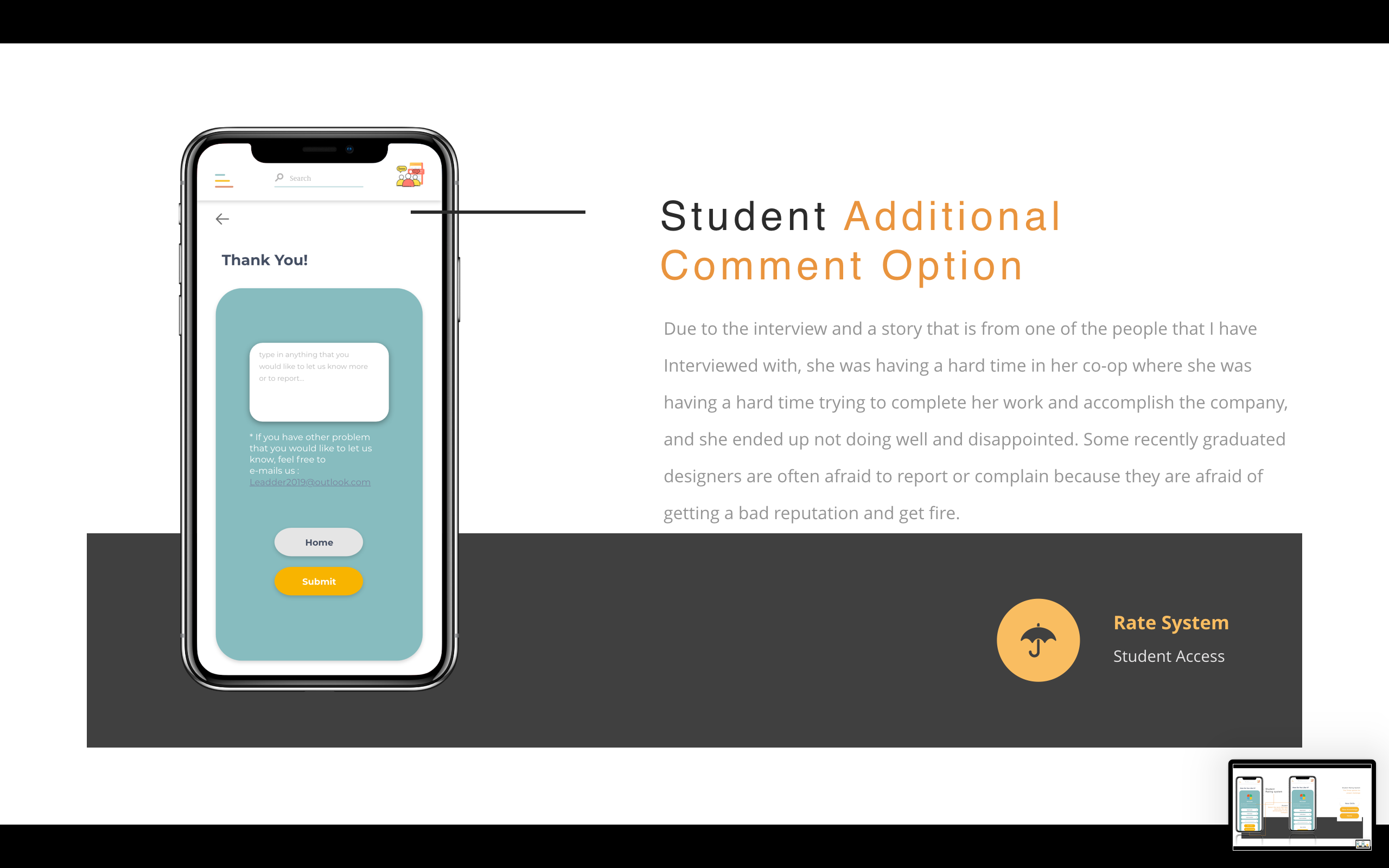
I feel lucky that I got great friends starting to help and user test within my site maps and draft prototype. The more I research the more problems that I found within the services that we have. Thinking back of what interaction designers propose which is to make people’s life easier, I am thinking that I should start making the designer’s life easier first. For Leadder, the main concept is to guidance the recent graduate designers to start, leading them to a place where they should begin with, providing tips for them, making sure there are still professionals to help them even they have graduated from the institute, and hoping they will become a leader for themselves or a team in the features. This is why I have named the phone application ‘Leadder’.
Janice Chen
I am passionate about different opportunities, especially in user interface design. I love coding and I will continue learning javascript, Html, and CSS.
https://www.behance.net/wchen18196b6f3
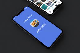
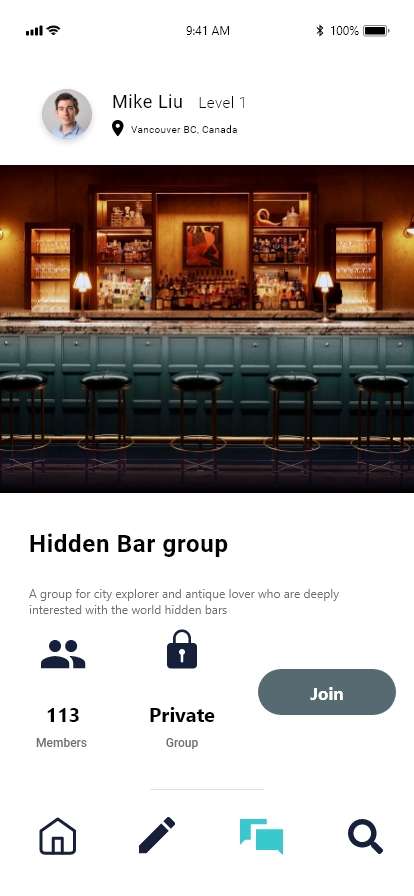
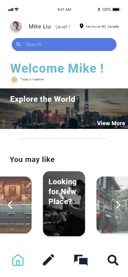
Niche Travel | Mike Liu
“Niche Travel” An Information exchange based travel app that focus on traveller community
Project Description
This project, with the aim of better serving people’s travel plans and leading a good and unique way of traveling mode, a specific travel app called Niche Travel is conceived and designed to meet the demand for the new trend of travel style.
Apart from the basic functionality of traditional travel apps, Niche Travel is hoped to provide more functions and serve as a personal tour guide that helps people to plan their own travel routes. Moreover, it is also a great platform that organizes the traveling community for people shares the common travel preference with their friends and strangers.
Key Features
Community
Niche Travel provide a platform for sharing the travel message of the same interest, and also provides a chance for a complete community to make common travel plans or easily share them in a group chat.
Information Exchange
Niche travel encourage users to provide and exchange
information with each other on the platform. All the information can goes into user’s private customized trip.

Interactive Prototype
About Mike Liu
Mike Liu (Liu Ming Heng) is an interaction design graduate from Emily Carr University of Art and Design who focuses on UI/UX, and graphic design in Vancouver, BC. Originating from Shanghai, China. My goal is to collaborate with both modern innovation and the traditional cultural elements in my design work. I hope to further develop the potential with digital interaction’s direct impact on people‘s daily life.
Problem Space:
With topics of social justice issues becoming more of a part in our daily conversations, it’s easy to passively support by sharing news on our phones and complain about all that is wrong in the world, but there must be a way we can use digital platforms to bring people to be active supporters.
How can we get people to be more involved with social justice issues?
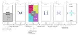
Interactive Prototype:
Approach:
As the sole designer for this project I was responsible for all steps of the design process from problem discovery to user experience and UI design.
People feel making a change at a global scale may seem like an impossible task. But when they focus on this idea at a local scale the task becomes more achievable. We don’t need big solutions but an accumulation of small changes that will make a big impact.
If I’m going make a digital platform to get people engaged with the local events within their area, it makes sense to design my screens with people in my community. Social justice is achieved best when people come together to support a cause they believe in and actively stay involved in a cause and bringing in elements of that into my design process was crucial. With that in mind, this was a perfect opportunity for co-creation workshops.
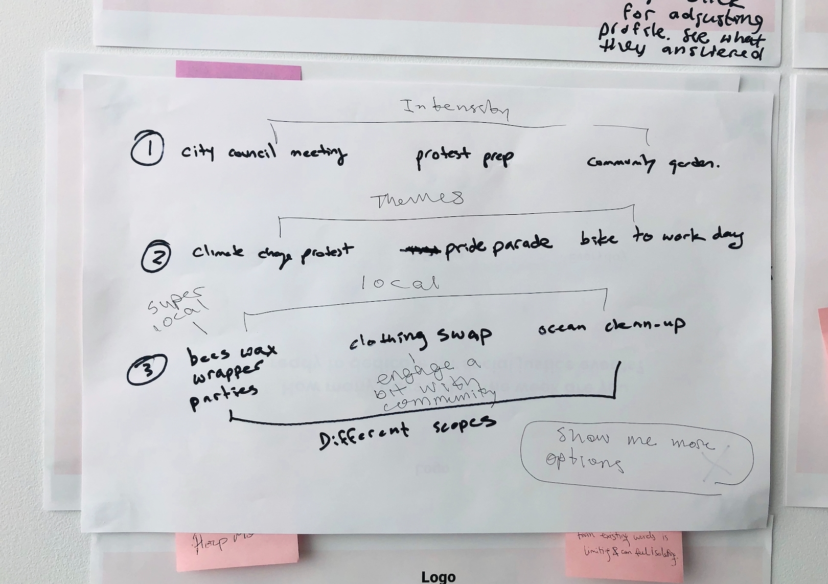
1st Co-creation Session:
All students at Emily Carr University were sent an email about the co-creation session and the first 10 students that confirmed the RSVP were chosen as the participants. The planned co-creation activities were: Brainstorming though mind-mapping and sketching on the different ways people can get involved in social justice issues. Discussing and talk about what are some barriers people face from getting involved in social justice issues. Narrowing the ideas down from the previous activities and think about how people could get involved in social justice issues for the first time.
Though these activities, I hoped to get insights from the following questions:
1. What are different ways you can get involved?
2. What are some psychological barriers or other barriers preventing people from being active supporters?
3. What are some way people can get involved in social justice events for the first time?
I was left wondering what happened? Did I not set this up right? How is it possible that we took up 1 1/2 hours and only got through the first activity?
After I replayed the co-creation session in my head, I realized how I’m going to approach the session differently in the second round. One of the most important things I learned was that I needed to get a different demographic of people for the next co-creation session. All 10 participants were designers from different fields. During the session I noticed there were lots of suggestions on how I could approach my problem, which was helpful, but each of them had strong opinions and their ideas were clashing.
2nd Co-creation Session:
The participants for the second co-creation workshop were chosen to ensure that I got a broader range of people. The planned co-creation activity was to have participants reflect on a take home question, bring their answers to the session and start co-creating the screens together.
I had asked the participants to answer a question: When you go through the prototype do you experience any of these feelings?
-
- Comfort
- Motivated
- Safe
- Prepared
- Inspired
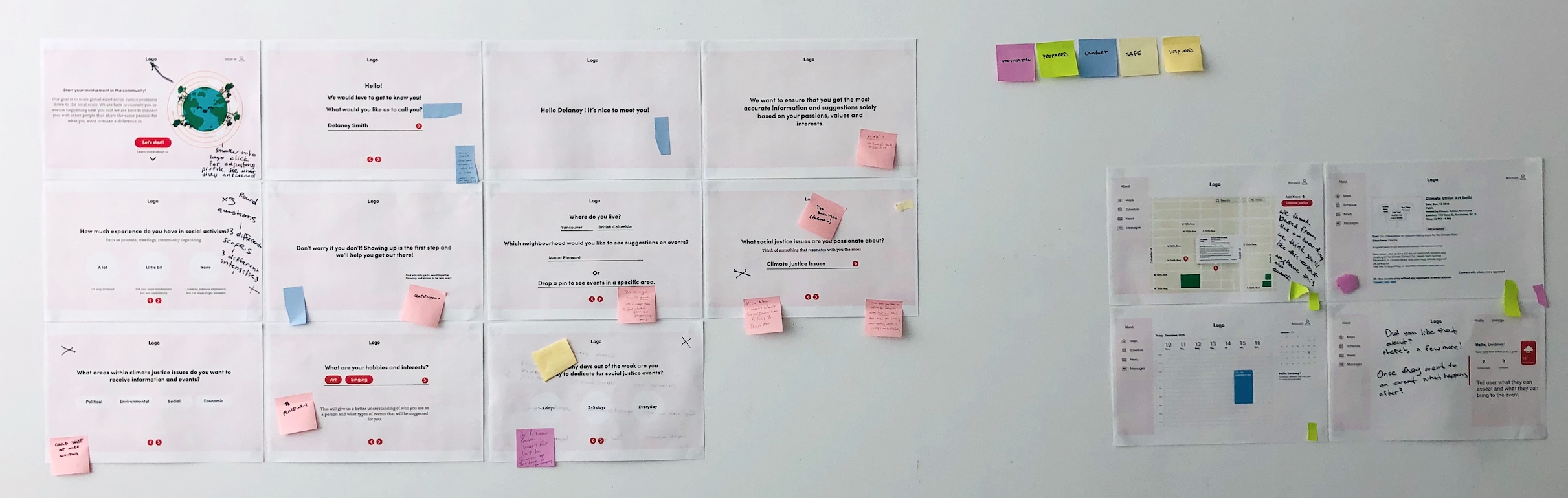
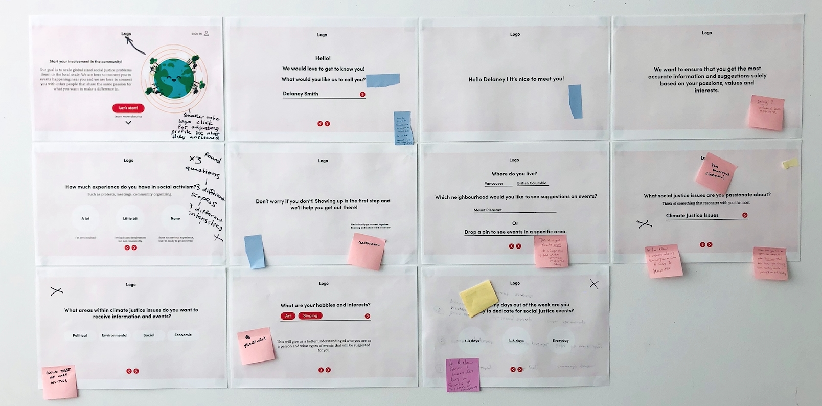
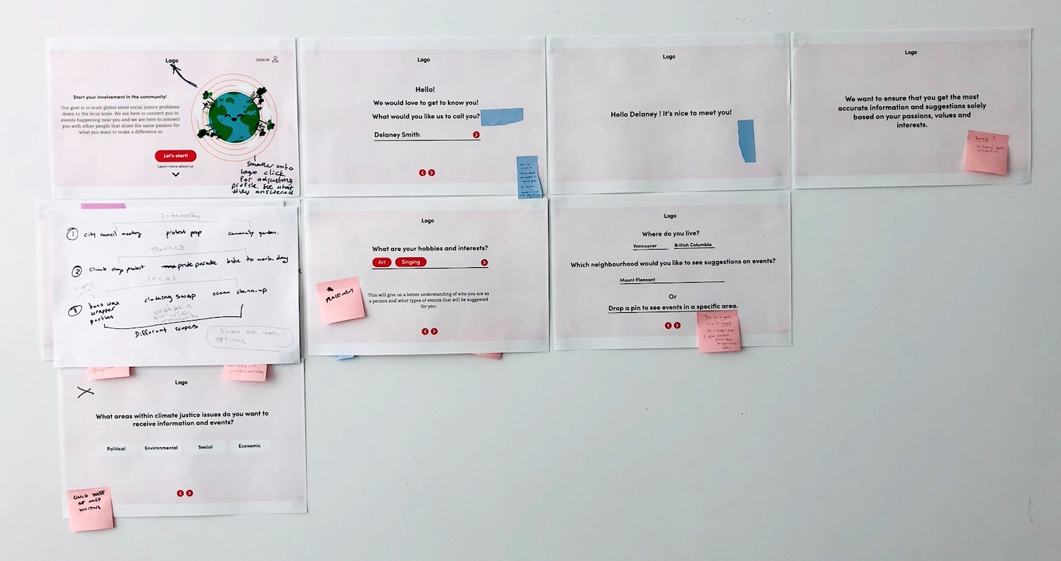
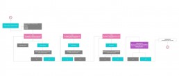
The images above represent the most important aspects of this successful co-creation session. After the initial analysis, I asked the participants to look over the screens, take out screens or add elements that didn’t convey those 5 feelings from the options I gave them in the question. You can see that screens were rearranged, some screens were taken out and new screens were created.
The co-creation workshops heavily determined the final prototype of my design and helped me refine the final project iterations. Since the goal of the project is to try and shift passive allies into active allies, I needed to make sure they didn’t lose interest in the on-boarding process. So knowing how the participants in my co-creation session interacted with the screens I provided, plays a huge factor in the success of my final outcome.
Reflection
The final outcome of my project heavily depended on the collaborative nature of the co-creation workshops. It was crucial to bring in people to get their perspectives on how they would take their first step into being an active supporter to make this project flourish.
The next steps is to run more co-creation workshops and to keep on iterating. There are no such things as finished designs and there’s always room for improvement!

About Jiyun Park
Recent graduate of the Interaction Design Program at Emily Carr University of Art & Design in Vancouver, British Columbia.
With a dual-focused practice that utilizes my expertise in both illustration and interaction I am able to incorporate both into my design work. I am well versed in all phases of product creation, from user research and profiling, to wire framing, prototyping, testing, and delivery.
I believe great designers desire to draw upon opportunities and strive to improve on design standards. Desire drives action.
I’m currently looking for opportunities in product design and UX design in the gaming industry or service design.
https://jiyunpark.com/